Sales Metrics Reporting: What to Track, How to Report, and What "Good" Looks Like
It's Monday morning. The VP asks for the pipeline number. The CRM says $4.2M. The manager's spreadsheet says $3.1M. The rep's forecast deck says $5M. Three people, three numbers, zero confidence in any of them.
Only 7% of sales orgs achieve forecast accuracy above 90%. The other 93% are guessing. That's not a metrics problem - it's a sales metrics reporting problem, and we've seen it tank quarterly planning at companies of every size.
The Short Version
Track 5-8 metrics, not 26. Report them by role and cadence. Fix your data before you build dashboards. Everything else in this article is the "how."
What Sales Metrics Reporting Actually Is
Sales metrics reporting isn't listing every number your CRM can generate. It's selecting, measuring, and presenting the specific data points that drive decisions at each level of your org. A CRM showing 47 charts isn't reporting - it's a data dump. Reporting is choosing the 5 numbers that tell you whether to hire, cut, or hold.
Here's a distinction worth internalizing: all KPIs are metrics, but not all metrics are KPIs. Metrics are any measurable data point - calls made, emails sent, deals created. KPIs are the 5-8 metrics you're actively managing against because they tie directly to business outcomes. Leading indicators (activity volume, pipeline created) tell you what's coming. Lagging indicators (revenue closed, win rate) tell you what already happened. Effective reporting balances both.
The Metrics That Matter
The most common complaint on r/salesoperations captures it perfectly: "We track 30 metrics and act on none of them." Let's narrow it down.
Pipeline and Conversion Metrics
These are your leading indicators - the numbers that tell you whether next quarter is in trouble before it's too late.
Pipeline velocity measures how fast deals move through your funnel. The formula: (number of opportunities x average deal value x win rate) / sales cycle length. It's the single best composite metric for pipeline health because it captures four variables in one number.
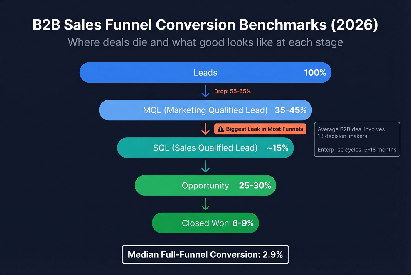
Stage conversion rates reveal where deals die. B2B benchmarks from Martal's 2026 analysis break down like this: Lead-to-MQL runs 35-45%, MQL-to-SQL drops to roughly 15% (the biggest leak in most funnels), SQL-to-Opportunity recovers to 25-30%, and Opportunity-to-Closed-Won lands at 6-9%. The median B2B conversion rate across the full funnel is 2.9%. Those numbers look worse when you factor in that the average B2B deal now involves 13 decision-makers, which is exactly why enterprise cycles stretch to 6-18 months and why tracking stage-level conversion matters more than top-of-funnel volume.
Pipeline coverage ratio is the one number every VP checks first. Minimum: 3:1 - three dollars of pipeline for every dollar of quota. Top performers keep coverage at 4:1 or higher. Below 3:1, you're hoping, not forecasting. If you want a tighter diagnostic set, start with pipeline health metrics that predict revenue early.
Revenue and Efficiency Metrics
| Metric | Formula | Benchmark Range | Review Cadence |
|---|---|---|---|
| Win Rate | Won / Total Opps | 20-30% (opportunity stage) | Weekly |
| Avg Deal Size | Revenue / Deals Won | SMB: $5K-25K, Mid: $25K-100K, Ent: $100K+ | Monthly |
| Sales Cycle | Avg days, create-to-close | SMB: 1-6 mo, Ent: 6-18 mo | Monthly |
| CAC | Sales+Mktg spend / New customers | Varies by segment | Quarterly |
| LTV:CAC | Customer LTV / CAC | 3:1 minimum, 4:1+ healthy | Quarterly |
Average deal size and sales cycle length shift dramatically by segment. Don't benchmark your enterprise motion against SMB averages - it'll look broken when it's actually normal. For deeper context on conversion and benchmarks, see sales conversion rate.
Executive and Board Metrics
Exec reporting needs a different lens entirely. These numbers show up in board decks and investor updates, and they need to tell a story in under 60 seconds.
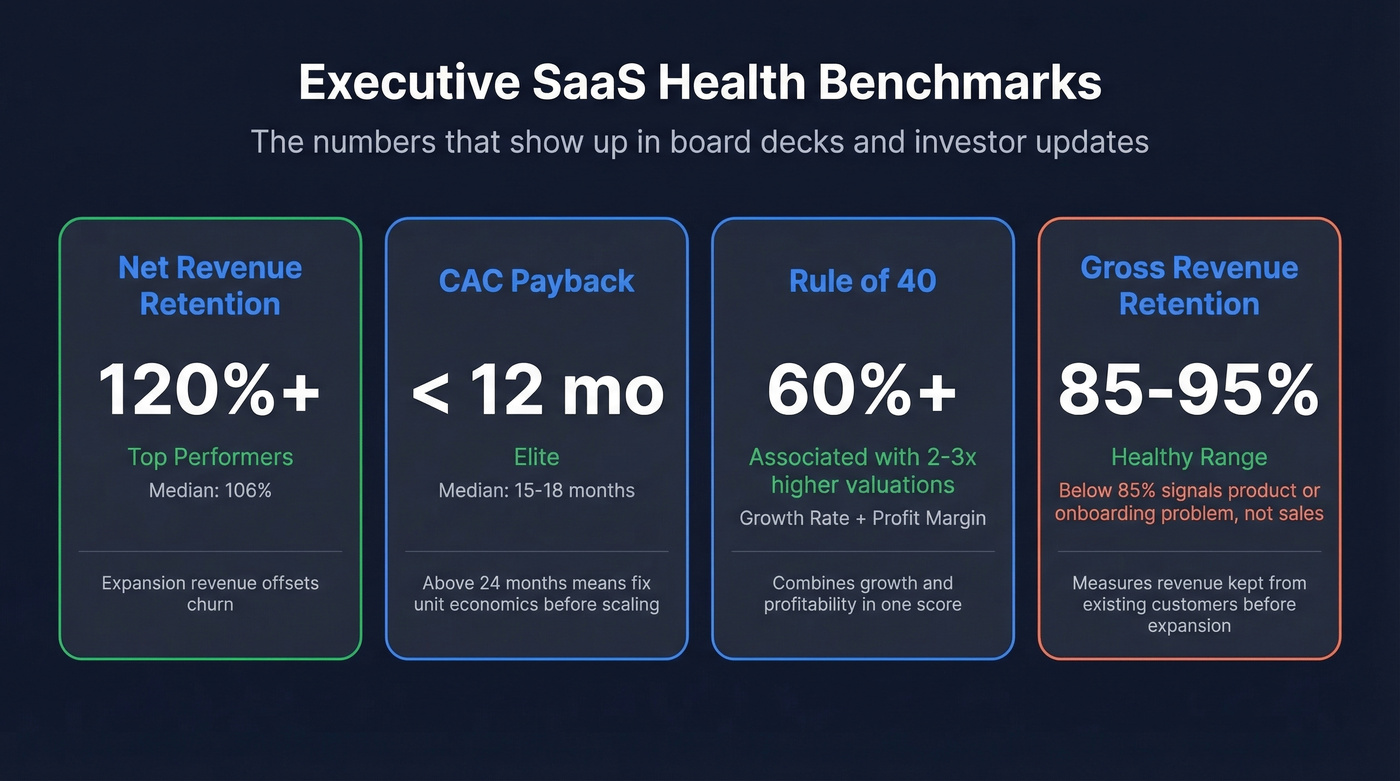
Net Revenue Retention (NRR) is the gold standard for SaaS health. Top performers hit 120%+, meaning expansion revenue from existing customers more than offsets churn. Median sits around 106%.
CAC payback - the median is 15-18 months. Elite companies get below 12. If yours is above 24, your unit economics need attention before you scale. Rule of 40 combines growth rate and profit margin; companies scoring above 60% are associated with 2-3x higher valuations. Gross Revenue Retention (GRR) should land between 85-95% - anything below 85% signals a product or onboarding problem, not a sales problem. If retention is the issue, run a proper churn analysis before you change comp plans.
What Each Stakeholder Needs
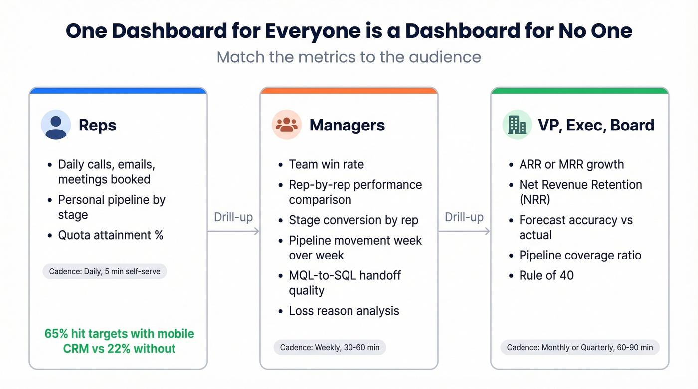
One dashboard for everyone is a dashboard for no one. The rep checking daily numbers doesn't need NRR. The CEO doesn't need individual call volumes.
Reps
Keep it tight: daily activity metrics (calls, emails, meetings booked), personal pipeline by stage, and quota attainment percentage. That's it. Reps need a dashboard they can glance at in 30 seconds between calls. Organizations using mobile CRM hit sales targets 65% of the time versus 22% without mobile access, so whatever you build needs to work on a phone. If you need to standardize what counts as "activity," use these sales activities examples as a baseline.
Managers
Managers need the coaching layer: team win rate, individual rep performance comparisons, stage-to-stage conversion by rep, and pipeline movement week over week. Include competitive win rates and loss reason analysis - these drive the 1:1 coaching conversations that actually move numbers.
Track MQL-to-SQL handoff metrics too. Aligned sales and marketing teams see roughly 20% annual revenue growth, while misaligned teams risk a 4% decline. Lead response time and handoff quality keep that alignment honest. If your handoff is messy, tighten your lead status definitions first.
VP, Exec, and Board
One screen, no scrolling. ARR or MRR growth, NRR, forecast accuracy versus actual, pipeline coverage ratio, and Rule of 40. If an exec needs to drill down, that's what the manager's dashboard is for. For tool options, compare sales forecasting solutions before you buy.
Building Reports That People Actually Use
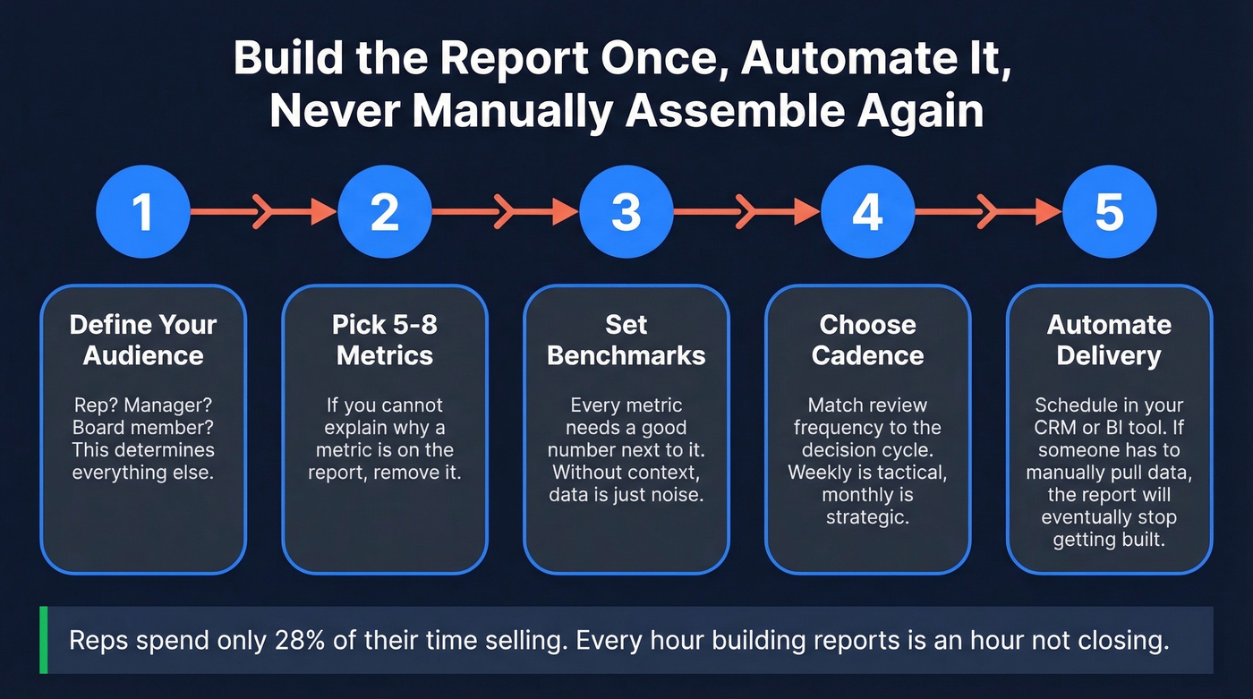
Reps spend only 28% of their time selling. Every hour spent building reports is an hour not spent closing. Build the report once, automate it, and never manually assemble it again.
The workflow that cuts through the noise:
- Define your audience. Who's reading this? A rep, a manager, a board member? That determines everything else.
- Pick 5-8 metrics. If you can't explain why a metric is on the report, remove it.
- Set benchmarks. Every metric needs a "good" number next to it. Without context, data is just noise.
- Choose cadence. Match review frequency to the decision cycle.
- Automate delivery. Schedule reports in your CRM or BI tool. If someone has to manually pull data, the report will eventually stop getting built.
Weekly reports focus on short-term pipeline health and rep activity - they're tactical. Monthly reports track longer-term trends, recurring revenue patterns, and progress against quarterly targets. Don't try to make one report serve both purposes. If you're rebuilding your funnel views, start from a proven B2B sales funnel template.
Bad contact data is the silent killer of every metric on this page. Bounce rates inflate CAC, stale emails destroy conversion rates, and wrong numbers tank rep activity KPIs. Prospeo's 98% email accuracy and 7-day data refresh cycle mean the pipeline numbers in your CRM actually reflect reality.
Fix the data layer and every sales metric improves downstream.
The Reporting Cadence That Works
Cadence isn't just "how often." It's who attends, how long the meeting runs, and what comes out of it. We've tested variations of this across dozens of sales orgs, and this structure consistently holds:
| Frequency | What to Review | Who Attends | Duration | Output |
|---|---|---|---|---|
| Daily | Activity, personal pipeline | Rep (self-serve) | 5 min | Self-correction |
| Weekly | Pipeline movement, forecast | Manager + reps | 30-60 min | Deal actions, coaching |
| Monthly | Win/loss, team trends, funnel | VP + managers | 60 min | Strategy adjustments |
| Quarterly | ARR, NRR, Rule of 40, CAC | Exec + board | 60-90 min | Resource allocation |
Demandbase's operational cadence framework recommends reps spend 60-70% of their time on selling activities, 10-15% in internal meetings, and 5-10% on admin and CRM updates. If your reporting cadence is eating into that selling time, you've overcomplicated it. If you run QBRs, align the meeting outputs with a clear QBR meaning and template.
One practical tip: alternate pipeline reviews and forecast calls on a biweekly rotation rather than cramming both into every weekly meeting. Pipeline calls focus on deal progression and coaching. Forecast calls focus on commit accuracy and coverage gaps.
A few governance basics that get skipped constantly: schedule recurring meetings in advance, standardize templates so every manager's pipeline review looks the same, define the outcome of each meeting before it starts, and store everything in the CRM - not in someone's personal Google Drive.
Reporting Mistakes That Destroy Trust
We've watched teams build beautiful dashboards that nobody trusts. Here's why that happens.
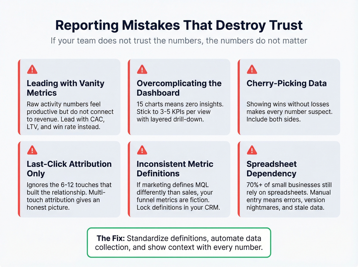
Leading with vanity metrics. Raw activity numbers feel productive but don't connect to revenue. Lead with CAC, LTV, pipeline influence, and win rate. Activity metrics belong in the rep's personal dashboard, not the exec summary.
Overcomplicating the dashboard. If your dashboard has 15 charts, it has zero insights. Stick to 3-5 KPIs per view with layered drill-down for anyone who wants detail.
Cherry-picking data. Showing wins without losses, or this quarter's pipeline without last quarter's forecast accuracy, erodes trust fast. Include both sides. Context and actions make bad numbers useful; hiding them makes every number suspect.
Relying on last-click attribution. Crediting the final touchpoint before a deal closes ignores the 6-12 touches that actually built the relationship. Multi-touch attribution is harder to implement but gives you an honest picture of what's driving pipeline.
Inconsistent metric definitions. If marketing defines an MQL differently than sales, your funnel metrics are fiction. Lock definitions in your CRM with lifecycle stages and timestamps. This is the single most common source of the "three different pipeline numbers" problem we described at the top.
Spreadsheet dependency. Over 70% of small businesses still rely on spreadsheets for sales tracking. Manual data entry introduces errors, version control nightmares, and reporting that's always a day behind.
Look - if your "sales report" is a Google Sheet someone updates on Friday afternoon, you don't have a reporting system. You have a liability.
How AI Is Changing Sales Analytics
AI adoption in revenue organizations has hit 89%, up from 34% in 2023. The impact on reporting is tangible: companies using AI-powered forecasting report 15-20% higher forecast accuracy, 25% shorter sales cycles, and up to 30% improvement in quota attainment.
The advantage comes from pattern recognition at scale - AI can analyze structured CRM data, behavioral engagement signals, and external market data simultaneously, then adapt in real time as deals progress. Deal risk scoring, next-best-action recommendations, and anomaly detection are moving from "nice to have" to standard RevOps infrastructure. If you want to go deeper on the analytics side, predictive analytics in sales is the next layer.
But here's the thing: AI amplifies whatever you feed it. Garbage data produces confidently wrong forecasts. An AI model trained on a CRM full of stale contacts, inconsistent stage definitions, and duplicate records will give you beautiful charts that are completely fictional. Fix the data first.
Fix Your Data Before Your Dashboards
Every reporting problem we've diagnosed eventually traces back to the same root cause: bad CRM data. Stale contacts make pipeline numbers fiction. Duplicate records inflate deal counts. Bounced emails mean your "active pipeline" includes prospects who never received your outreach.
Most teams get the sequence backwards. They buy a BI tool, build dashboards, then wonder why the numbers don't match reality. The fix starts upstream - with the data itself. Prospeo enriches and verifies CRM contacts with 98% email accuracy and a 92% API match rate, returning 50+ data points per contact. Its 7-day refresh cycle keeps records current, compared to the 6-week industry average - that's the difference between a pipeline report that reflects reality and one that's already outdated when you pull it. Native Salesforce and HubSpot integrations mean enrichment runs automatically, not as a quarterly cleanup project someone forgets to schedule. If you're evaluating vendors, start with this roundup of data enrichment services.
Your sales report is only as good as your CRM data. If contacts bounce, phone numbers are disconnected, and job titles are two roles ago, no dashboard will give you accurate pipeline numbers.
Reps spending 72% of their time not selling is bad enough - don't make it worse with manual list-building. Prospeo's 30+ search filters, CRM enrichment, and 92% match rate give your team verified contacts in seconds, not hours. More selling time means better numbers on every dashboard in this article.
Give your reps data worth reporting on.
Tools and What They Cost
Sales reporting tools fall into three buckets: CRM-native analytics (built into your existing CRM), BI platforms (for custom visualization), and revenue intelligence (AI-powered forecasting and deal inspection). Most teams need one from the first two categories. Revenue intelligence is worth it once you're past ~20 reps and forecast accuracy becomes a board-level concern.
Let's be honest: if your average deal is under $15K, you don't need a $150/user/month revenue intelligence platform. A well-configured CRM with clean data will outperform an expensive tool sitting on top of a messy database every single time. Spend the money on data quality first, then layer on sophistication.
When evaluating tools, prioritize interactive dashboards, customizable templates, scheduled delivery, role-based permissions, and AI-generated report summaries where available. If you're still deciding what "counts" as a CRM, here are real examples of a CRM with pricing.
| Category | Tool | Starting Price | Best For |
|---|---|---|---|
| CRM-native | Salesforce Sales Cloud | ~$25/user/mo+ | Teams 50+ reps |
| CRM-native | HubSpot Sales Hub | Free-~$150/user/mo | SMB to mid-market |
| CRM-native | Pipedrive | ~$14/user/mo | Small teams |
| BI | Tableau | ~$15/user/mo+ | Advanced visualization |
| BI | Power BI | ~$10/user/mo (Pro) | Microsoft shops |
| BI | Looker Studio | Free | Budget dashboards |
| Rev Intelligence | Gong | ~$100-160/user/mo (annual) | Forecast + calls |
| Rev Intelligence | Clari | ~$50-120/user/mo (annual) | Pipeline at scale |
| Data Quality | Prospeo | ~$0.01/email, free tier | CRM enrichment |
Skip revenue intelligence tools entirely if your team is under 10 reps - the ROI won't be there yet. For small teams, a clean CRM plus Looker Studio gets you 80% of the way.
FAQ
What's the difference between sales metrics and sales KPIs?
All KPIs are metrics, but not all metrics are KPIs. Metrics are any quantifiable data point your sales process generates. KPIs are the 5-8 metrics you've deliberately chosen to manage against because they tie directly to revenue, efficiency, or growth outcomes.
How many sales metrics should I track?
Five to eight per stakeholder view. More than that and your dashboard becomes wallpaper nobody checks. Reps need activity and pipeline, managers need conversion and coaching signals, execs need ARR and forecast accuracy.
How often should I review sales reports?
Reps should check dashboards daily (5 minutes). Managers review team performance weekly in 30-60 minute pipeline calls. Execs review monthly or quarterly, matching cadence to the decision cycle each metric supports. Don't force everyone into the same rhythm.
What's a good pipeline coverage ratio?
The minimum is 3:1 - three dollars of pipeline for every dollar of quota. Top-performing teams maintain 4:1 or higher. Below 3:1, you're relying on hope rather than math, and your forecast accuracy will suffer accordingly.
How do I fix bad CRM data that's breaking my reports?
Start with automated enrichment and verification. Tools like Prospeo refresh contact records on a 7-day cycle and return 50+ data points per contact at 98% email accuracy. Pair that with standardized field definitions, duplicate management, and mandatory fields at deal creation to prevent data decay at the source.