Sales Reporting: The Practitioner's Guide to Reports That Actually Get Used
It's Monday morning. The VP of Sales asks for the pipeline number. Three people give three different answers - one from Salesforce, one from a spreadsheet someone exported to Excel on Friday, and one from a manager who's counting verbal commits as signed contracts. The forecast meeting turns into a debate about definitions instead of strategy.
This is what broken sales reporting looks like, and it's fixable. The problem is rarely a lack of data. Most B2B teams are drowning in it. The problem is that nobody trusts the numbers. Reps export to Excel because pulling a Salesforce report requires an admin. Marketing counts MQLs one way while sales counts SQLs another, so the funnel report is fiction before anyone opens it. Pipeline is inflated with contacts who changed jobs six months ago. And every Monday, the same argument plays out: whose number is right?
The fix isn't more dashboards. It's fewer reports built on cleaner data, reviewed at the right cadence by the right people.
What You Need (Quick Version)
Before you read 2,900 words, here's the short version:
- You need 3-4 core reports at the right cadence, not 47 dashboards nobody trusts. More on which reports actually matter in The Reports That Matter.
- Agree on definitions before you touch a single tool. "Opportunity" means different things to different reps. Fix that first. See Five Reporting Mistakes.
- Fix your CRM data quality first. Reports built on stale contacts and decayed emails are fiction. Jump to Fix Your Data First for the practical steps.
If your reporting already works and you just need tool recommendations, skip straight to The Reporting Stack.
What Sales Reporting Actually Is
Sales reporting is the process of turning raw CRM and pipeline data into decisions. Not dashboards. Not charts. Decisions.
The typical approach is to list 8-20 report types. That's how you end up with 47 dashboards nobody looks at. You need 3-4 core reports, built on clean data, reviewed at the right cadence by the right people. Everything else is decoration.
The payoff for getting this right is real. McKinsey found that companies applying digital and analytics to sales effectively typically see 5-10% revenue growth, often within a few months. And teams using CRM dashboards consistently see an average 29% increase in sales. The gap isn't between teams that have data and teams that don't - it's between teams that trust their reports and teams that export to Excel and hack it together.
The Sales Reports That Matter
Here's the full menu, then we'll focus on the four that actually drive decisions:

| Report Type | Core Question It Answers | Key Metric |
|---|---|---|
| Pipeline | Do we have enough? | Coverage ratio |
| Conversion | Are we efficient? | Stage-to-stage % |
| Activity | Are reps doing the work? | Calls, meetings, emails |
| Forecast vs Actual | Can we predict? | Variance % |
| Won/Lost Analysis | Why do we win or lose? | Win rate by reason |
| Sales Cycle | How long does it take? | Days to close |
Pipeline & Forecast Reports
Pipeline coverage ratio is the single most important leading indicator in B2B sales. The benchmark is 3-5x quota coverage per rep per quarter. Below 3x, you're hoping. Above 5x, you probably have a qualification problem - too much junk in the pipe.
The formula is simple:
Pipeline Coverage = Total Weighted Pipeline / Quota
Your forecast report sits right next to this. It compares what you predicted against what actually closed, and the gap between those two numbers is your credibility score with the CFO. We've seen teams where forecast accuracy swings 40% month over month - that's not a reporting problem, it's a process problem. Track forecast variance weekly and you'll spot the reps who sandbag and the ones who are perpetually optimistic. (If you're tightening your process, it helps to track pipeline health alongside forecast variance.)
Conversion & Activity Reports
Healthy opportunity conversion rates in B2B SaaS range from 20-30%. Below 15%, either your top-of-funnel qualification is broken or your reps aren't progressing deals effectively. Above 35%, you might not be creating enough pipeline - you're only working sure things.
The formulas worth tracking:
- Win Rate = Deals Won / Total Deals Closed (Won + Lost)
- Sales Velocity = (# Opportunities x Avg Deal Size x Win Rate) / Sales Cycle Length
- Conversion Rate = Opportunities Moving to Next Stage / Total Opportunities in Prior Stage
Activity reports - calls made, emails sent, meetings booked - are the most abused report type in sales. They're useful as a diagnostic when conversion drops, not as a daily leaderboard. If your reps are hitting activity targets but missing quota, the activity targets are wrong. (If you need a clean definition of what to count, use these sales activities as a baseline.)
Won/Lost & Cycle Analysis
Won/lost analysis is where you find the actual insights. Tag every closed deal with a primary win or loss reason, then review the patterns quarterly. You'll find things like "we lose 60% of deals where legal gets involved after stage 3" or "we win 80% of deals where the champion attended the demo." Those patterns are worth more than any dashboard.
Sales cycle length varies dramatically by segment. Enterprise deals run 6-18 months; SMB deals close in 1-6 months. Track this by segment, not as a blended average, or you'll mask the real story.
KPI Benchmarks by Segment
What "good" actually looks like, segmented by company size:
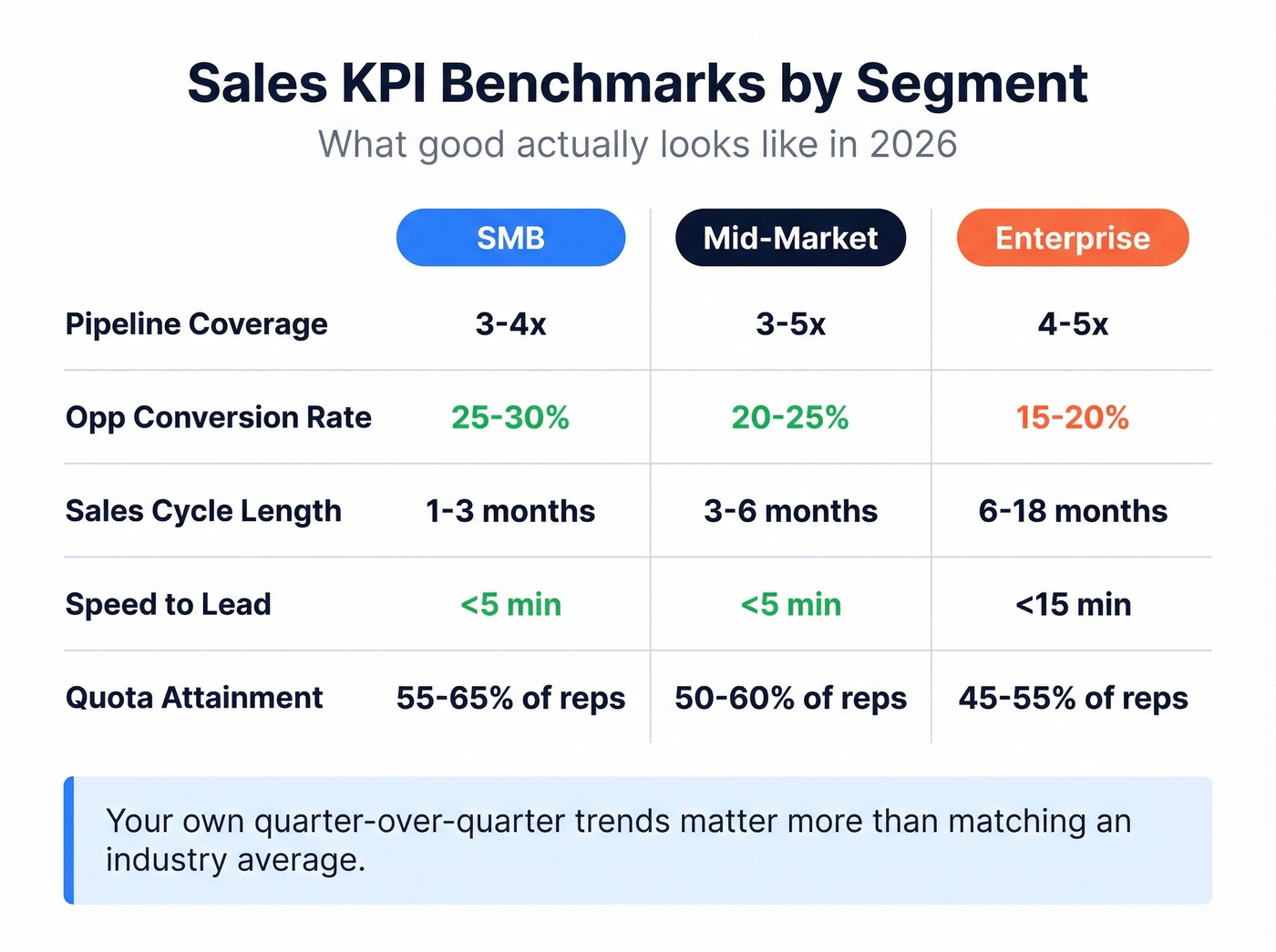
| KPI | SMB | Mid-Market | Enterprise |
|---|---|---|---|
| Pipeline Coverage | 3-4x quota | 3-5x quota | 4-5x quota |
| Opp Conversion Rate | 25-30% | 20-25% | 15-20% |
| Sales Cycle Length | 1-3 months | 3-6 months | 6-18 months |
| Speed-to-Lead | <5 min | <5 min | <15 min |
| Quota Attainment | ~55-65% of reps | ~50-60% of reps | ~45-55% of reps |
| Mobile CRM Adoption | High (65% hit targets) | Medium | Lower |
A few things jump out. Speed-to-lead under 5 minutes improves conversion measurably, and yet most teams don't even track it. Mobile CRM users are 65% likely to hit sales targets vs 22% without mobile access. That's a 3x difference from a device preference.
The quota attainment numbers are sobering. In most B2B orgs, roughly half the team misses quota in any given quarter. That's not a reporting stat - it's the context your reports exist within. If your sales report doesn't help managers identify struggling reps early enough to intervene, it's not doing its job. (For a broader baseline, compare against current sales pipeline benchmarks.)
Here's the thing: if your average deal size is under $10K, you don't need a $100K revenue intelligence platform. You need clean data, 3-4 reports, and a manager who reviews them weekly. Most reporting problems are process problems wearing a technology disguise.
Don't treat these benchmarks as targets. They're baselines. Your own quarter-over-quarter trends matter more than whether you match an industry average.
Choosing the Right Cadence
The biggest cadence mistake is reviewing everything monthly. By the time you see a monthly conversion drop, you've already lost 4 weeks of deals.
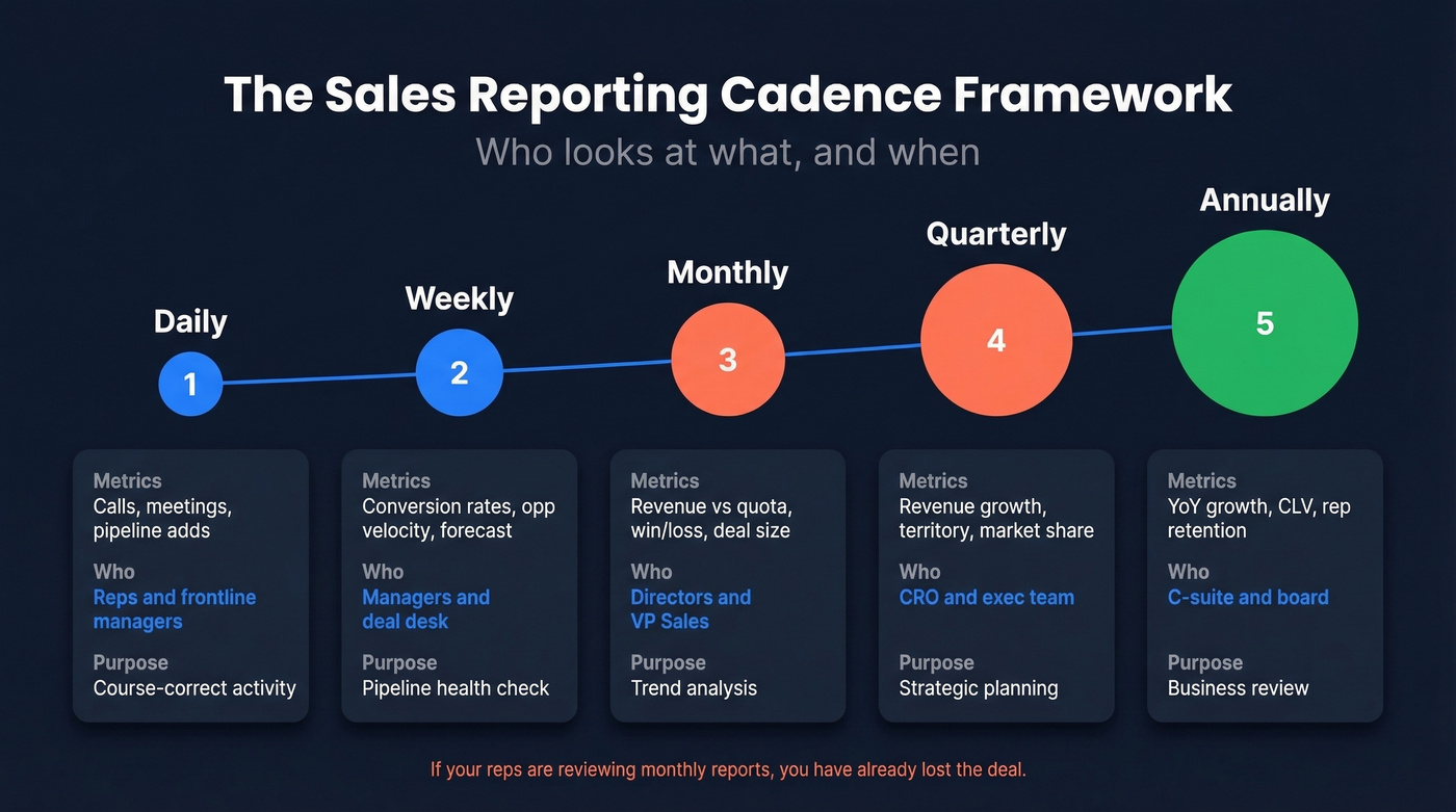
| Frequency | Key Metrics | Audience | Purpose |
|---|---|---|---|
| Daily | Calls, meetings, pipeline adds | Reps, frontline managers | Course-correct activity |
| Weekly | Conversion rates, opp velocity, forecast | Managers, deal desk | Pipeline health check |
| Monthly | Revenue vs quota, win/loss, deal size | Directors, VP Sales | Trend analysis |
| Quarterly | Revenue growth, territory, market share | CRO, exec team | Strategic planning |
| Annually | YoY growth, CLV, rep retention | C-suite, board | Business review |
If your reps are reviewing monthly reports, you've already lost the deal. Reps need daily visibility into their own activity and pipeline. Managers need weekly conversion and forecast data. Executives need monthly and quarterly revenue trends.
Everyone looking at the same report at the same cadence is a sign that nobody's actually using the data - they're just attending a meeting.
Role-based views aren't optional. A rep's dashboard should show their pipeline, their activity, and their next actions. A VP's dashboard should show revenue trends, forecast accuracy, and team-level conversion. Mixing these creates noise for everyone. (If you're formalizing ownership, this is typically driven by a RevOps Manager.)
Pipeline reports built on stale contacts are fiction. Prospeo's CRM enrichment returns 50+ data points per contact with a 92% match rate - refreshed every 7 days, not every 6 weeks. Your forecast is only as accurate as the data behind it.
Stop debating numbers. Start trusting them.
Dashboard Design That Gets Used
Most dashboards fail the 4-Question Insight Test: Is this good or bad? How good or bad? Why? What should we do about it?
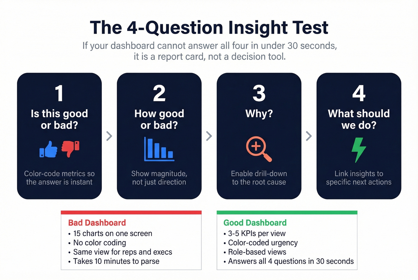
If your dashboard can't answer all four in under 30 seconds, it's a report card, not a decision tool.
Limit each view to 3-5 KPIs. The moment you add a sixth metric, attention fragments. An executive dashboard needs won revenue, weighted pipeline, conversion rates, forecast vs actual, and maybe one more. That's it. Layer detail underneath for people who want to drill down.
Design for mobile first. The 65% vs 22% quota attainment gap between mobile and non-mobile CRM users is too large to ignore. If your dashboard doesn't render cleanly on a phone, your field reps won't use it.
Build role-based views. A rep's homepage should show their pipeline by stage, activity for the day, and deals at risk. A manager's view should show team conversion rates, forecast accuracy, and stalled opportunities. A CRO's view should show revenue vs plan, pipeline coverage, and quarter-over-quarter trends. One dashboard for everyone is a dashboard for no one. (If you're standardizing what “good” looks like, align dashboards to your sales operations metrics.)
Color-code stalled deals and at-risk opportunities - visual urgency drives action faster than a number in a table.
Five Reporting Mistakes That Destroy Trust
1. Tracking vanity metrics instead of business KPIs. Calls made and emails sent feel productive to measure. They're not. Track CAC, LTV, pipeline influence, and conversion rates instead. Activity metrics are diagnostic tools, not scorecards.
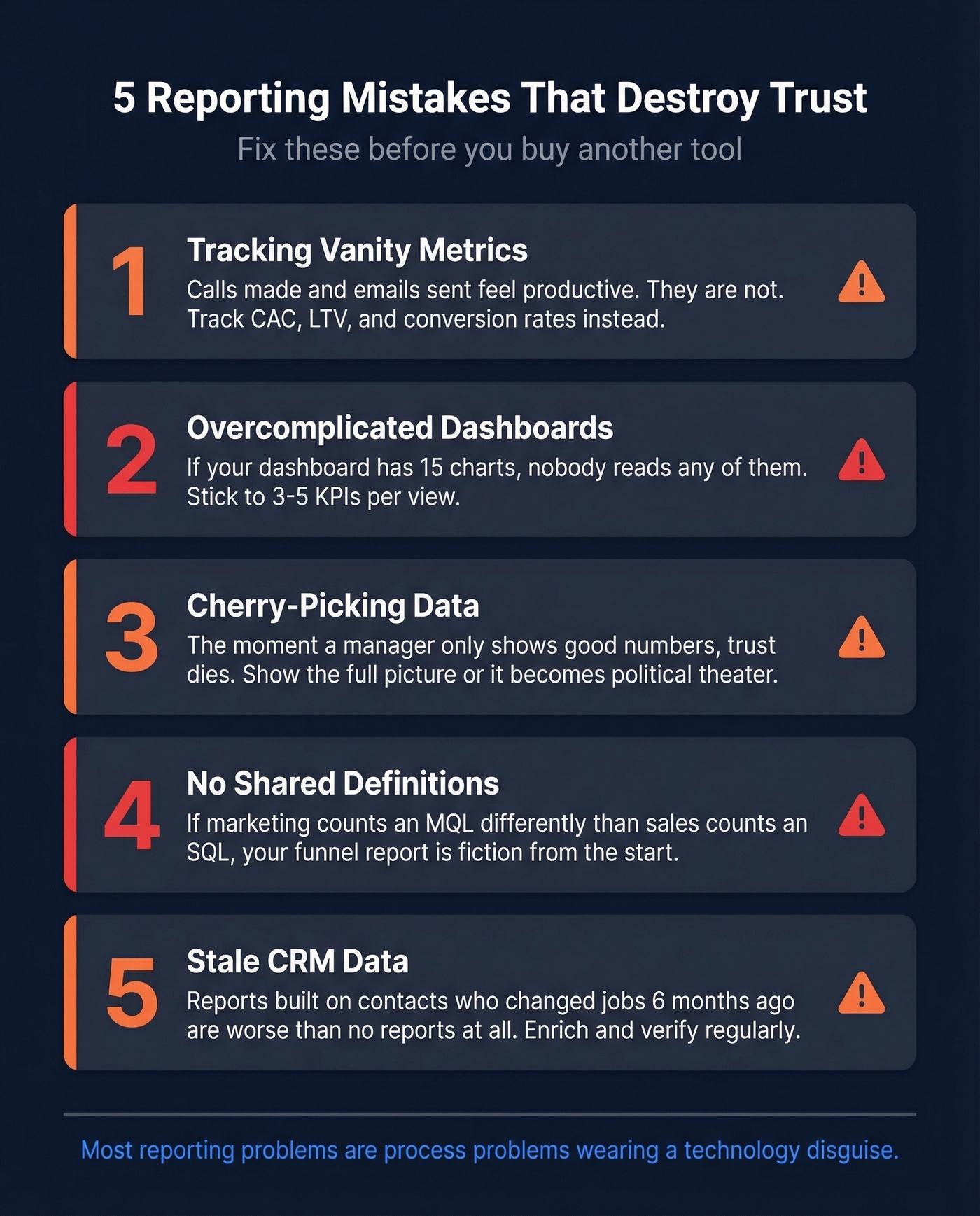
2. Overcomplicated dashboards. If your dashboard has 15 charts on one screen, nobody's reading any of them. Stick to 3-5 KPIs per view with layered detail underneath. An executive summary that takes 10 minutes to parse isn't a summary.
3. Cherry-picking data. The moment a manager only shows the good numbers in a QBR, trust dies. Everyone in the room knows what's being hidden. Show the full picture - wins, losses, and the ugly stuff - or your reports become political theater. (If you want to level up the meeting itself, use these QBR questions to force clarity.)
4. No shared definitions. This is the silent killer. If marketing counts an MQL differently than sales counts an SQL, your funnel report is fiction. The fractured reality problem - where dashboards, forecasts, and CRM reports disagree because teams define terms differently - destroys more reporting programs than bad tools ever will. Lock definitions for MQL, SQL, opportunity stages, attribution windows, and pipeline coverage. Write them down. Make RevOps the arbiter. (If you need a framework for the funnel itself, map it to an AIDA sales funnel or your existing stages.)
5. Ignoring data quality. Garbage in, garbage out. The #1 complaint about Salesforce on Reddit? Sales teams export to Excel and hack it together because they can't get useful reports without an admin. HubSpot users hit a wall when the report builder only lets you combine two data sources. But the deeper issue isn't the tool - it's the data feeding it. Stale contacts, missing fields, and duplicate records make every report unreliable. (If you're evaluating vendors, start with a shortlist of data enrichment services.)
Fix Your Data First
B2B contact data decays roughly 30% per year. People change jobs, companies get acquired, email addresses go stale. If you haven't cleaned your CRM in 6+ months, a meaningful chunk of your pipeline is attached to contacts who've already moved on.
The chain reaction is predictable: bad contact data leads to stale pipeline, which leads to wrong conversion rates, which leads to useless forecasts, which leads to nobody trusting the reports, which leads to everyone exporting to Excel. We've watched this cycle play out at multiple companies, and it always starts with data quality.
The practical fix:
- Audit your CRM quarterly. Flag contacts with no activity in 90+ days, missing email addresses, or outdated job titles.
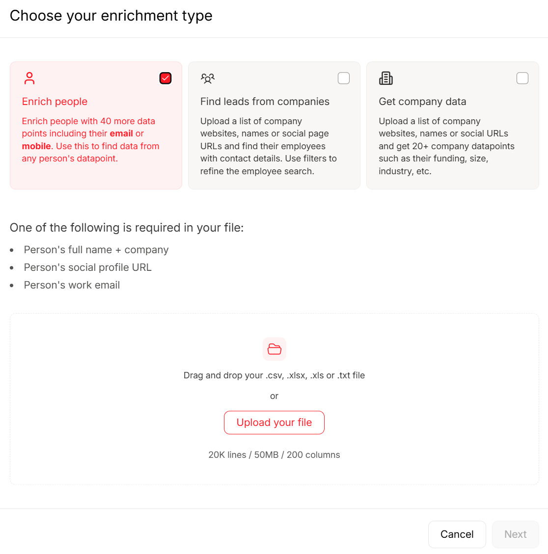
- Enrich missing fields systematically. Don't ask reps to manually update records - they won't. (This is the core of lead enrichment.)
- Verify emails before outbound. A 15% bounce rate doesn't just hurt deliverability; it means a meaningful chunk of your contacts are unreachable. (If you’re diagnosing the impact, track your email bounce rate.)
- Standardize stage definitions. Make sure every rep uses the same criteria for moving a deal forward.
Tools like Prospeo handle the enrichment and verification piece well - run your CRM database through it quarterly and the native Salesforce and HubSpot integrations make this a push-button operation instead of a CSV export nightmare. When your contact data is accurate, your pipeline reports actually reflect reality.
The Reporting Stack
The reporting stack breaks into four layers. Every team needs layers 1 and 2. Layers 3 and 4 depend on your complexity and budget.

Layer 1: CRM (System of Record)
Salesforce is the enterprise default, with Sales Cloud starting at $25/user/mo. Realistically, you're paying $75-150/user/mo once you add the features you actually need - and you'll need a dedicated admin to build reports. Powerful, but not self-serve. (If you’re budgeting, see Salesforce pricing.)
HubSpot Sales Hub runs around $90-100/user/mo for Pro-tier. Simpler to use, but the two-data-source limitation in the report builder is a real ceiling. If you need to join more than two objects in a single report, you'll hit it fast.
Skip both if you're under 20 reps. Pipedrive at $14/user/mo gives you straightforward pipeline tracking without the overhead. It won't scale forever, but it doesn't need to.
Layer 2: Data Quality & Enrichment
This is the layer most teams skip, and it's why their reports are wrong. Your CRM data decays 30% annually - if nothing's cleaning it, your reports are built on a foundation that's eroding in real time. Prospeo handles CRM enrichment and email verification with 98% email accuracy and 50+ data points per contact, so the numbers flowing into your BI dashboards are clean. At roughly $0.01/email with a free tier, there's no reason to skip this step.
Layer 3: BI and Analytics
Once you need cross-object reporting or data from multiple sources, you need a BI layer.
For teams living in Microsoft 365, Power BI at $10/user/mo is the obvious pick - tight integration, familiar interface, and the price is hard to argue with. Tableau at $15/user/mo for Viewer licenses is a common enterprise visualization standard, though it demands more setup time than most teams expect.
For SMBs who want one screen showing metrics from multiple tools, Databox from $159/mo aggregates dashboards without requiring a data engineer. And then there's Coefficient at $49/mo - it lives inside your spreadsheet, which is quietly brilliant. The reps who refuse to leave Excel can still get live CRM data without anyone fighting about it.
Layer 4: Revenue Intelligence
This is where AI enters the picture, and where conversation data is becoming a genuine reporting input. What reps log in the CRM is aspirational; what they actually say on calls is reality. The gap between those two narratives is where forecast accuracy goes to die. (If you’re comparing options, start with these sales forecasting solutions.)
Forecastio at $199/2 seats/mo is purpose-built for HubSpot forecasting - narrow focus, but it does that one thing well. Gong typically costs around $100-150/user/mo and captures and analyzes call recordings, surfacing patterns like "deals where the competitor was mentioned in discovery close at half the rate." That's reporting intelligence you can't get from CRM fields alone. Clari runs around $30K-100K+/year depending on seats and modules and is built for enterprise revenue ops. If a tool doesn't integrate bidirectionally with your CRM, it's dead on arrival. Don't even evaluate it.
| Layer | Tool | Best For | Starting Price | Free Tier? |
|---|---|---|---|---|
| CRM | Salesforce | Enterprise w/ admin | $25/user/mo (real: $75+) | No |
| CRM | HubSpot Sales Hub | Mid-market simplicity | ~$90-100/user/mo (Pro) | Yes (basic) |
| CRM | Pipedrive | Small teams (<20) | $14/user/mo | Trial only |
| Data Quality | Prospeo | Enrichment + verification | ~$0.01/email | Yes |
| BI | Power BI | Microsoft-stack teams | $10/user/mo | No |
| BI | Tableau | Enterprise visualization | $15/user/mo (Viewer) | No |
| BI | Databox | SMB dashboard aggregation | $159/mo | Yes |
| BI | Coefficient | Spreadsheet-native | $49/mo | Yes |
| Revenue Intel | Forecastio | HubSpot forecasting | $199/2 seats/mo | No |
| Revenue Intel | Gong | Conversation intelligence | ~$100-150/user/mo | No |
| Revenue Intel | Clari | Enterprise revenue ops | ~$30K-100K+/yr | No |
AI-powered forecast models improve accuracy by 10-20% over manual methods. That's meaningful - but only if the underlying data is clean. We've seen teams buy Gong or Clari expecting magic, then realize the AI is just confidently analyzing garbage data. Fix layers 1 and 2 before you invest in layer 4.
AI and Sales Reporting in 2026
Let's be honest about where most teams actually stand. Every sales org talks about AI dashboards, but most are stuck at level one of a four-level maturity ladder:
- Descriptive - What happened? (Standard CRM reports)
- Diagnostic - Why did it happen? (Win/loss analysis, drill-downs)
- Predictive - What will happen? (AI-powered forecasting)
- Prescriptive - What should we do? (Next-best-action recommendations)
Most teams are at level 1, maybe level 2. The tools for levels 3 and 4 exist - Gong, Clari, and even Salesforce Einstein offer predictive and prescriptive capabilities. But 40% of automation teams don't feel ready to adopt AI, and the readiness gap is usually about data quality and process maturity, not technology.
The trajectory is clear. Over 70% of B2B sales organizations are expected to use AI-driven intelligence platforms by 2026. Gartner projects 60% of sales tasks will be executed by generative AI within five years. McKinsey estimates that acting on real-time commercial signals reduces sales cycle length by up to 25%.
Natural-language copilots are becoming standard - ask your dashboard a question in plain English and get an answer. Anomaly detection is moving from "nice to have" to default, where your dashboard flags a 15% conversion drop before you notice it in a weekly review.
Start with clean data and consistent definitions before you chase AI dashboards. A prescriptive AI model built on a CRM where reps don't update deal stages is just expensive guesswork.
Inflated pipelines full of job-changers and dead emails destroy forecast accuracy. Prospeo tracks job changes, verifies emails at 98% accuracy, and flags decayed contacts automatically - so your reports reflect reality, not last quarter's org chart.
Clean data in, trusted reports out. It starts at $0.01 per email.
FAQ
What's the difference between a sales report and a dashboard?
A sales report is a point-in-time snapshot capturing data as of a specific date; a dashboard is a live, continuously updating view of your KPIs. Most teams need both: dashboards for daily monitoring and reports for weekly or monthly deep analysis.
How often should teams review reports?
Reps check activity and pipeline daily. Managers review conversion and forecast weekly. Executives examine revenue trends monthly or quarterly. Match cadence to the decision the data supports - daily for course-correction, quarterly for strategy.
What's the most important KPI to track?
Pipeline coverage ratio - aim for 3-5x quota. It's the earliest reliable predictor of whether you'll hit your number. By the time revenue metrics flag a problem, it's too late for the current quarter.
How do I fix bad CRM data ruining my reports?
Audit quarterly, enrich contacts systematically with a dedicated data quality tool, standardize field definitions across teams, and automate data entry hygiene. Manual cleanup doesn't scale - make clean data the default, not a quarterly project.