What Is a Sales Report - and How to Build One That Actually Gets Read
It's Monday morning. Your VP asks for a pipeline update. You export the CRM to Excel, spend 90 minutes formatting, and send a 15-tab spreadsheet. The reply: "Can you just tell me if we're going to hit quota?"
We've seen this play out dozens of times. The problem isn't that teams lack data - it's that most reports try to say everything and end up saying nothing. If your sales reports keep missing the mark, the fix is almost always the same: fewer metrics, more context, and a clear answer to "so what?"
The Short Version
A sales report is a point-in-time document analyzing sales data over a defined period. Most teams need three reports done well - pipeline, activity, and forecast - not ten done poorly. Focus on 5-7 KPIs per report, always include context, and match cadence to audience. The #1 thing that kills report accuracy isn't the wrong chart. It's bad data going into the CRM.
Sales Report Defined
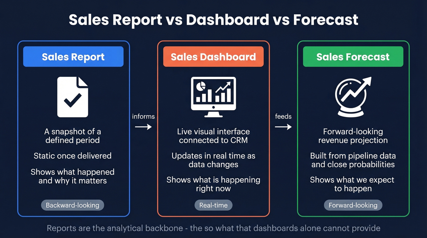
A sales report pulls CRM data from a specific time period, analyzes it against goals, and turns numbers into decisions. It's not a dashboard, and it's not a forecast - though it feeds both.
Here's the distinction that trips people up:
- Sales report - A snapshot covering a defined period. Static once delivered. A record of what happened and why it matters.
- Sales dashboard - A live visual interface connected to your CRM, updating as data changes. It shows right now; a report shows what happened.
- Sales forecast - A forward-looking projection of expected revenue, built from pipeline data and close probabilities.
Reports inform dashboards and forecasts. They're the analytical backbone - the "so what?" that dashboards alone can't provide.
Why Reporting Matters
A Deloitte survey found 87% of companies consider sales reporting important or very important. That number's high, but the execution gap is enormous. Without structured reporting, forecast errors run 20-30%, which means your revenue projections are essentially guesses.
Good reports do two things most teams undervalue. First, they create accountability without micromanagement - when reps see their own numbers in context, not just raw activity counts but how those activities convert, managers don't need to hover. Second, they catch problems early. A weekly pipeline report spots a stalled mid-funnel before it becomes a missed quarter.
Then there's alignment. Marketing sees which leads convert. Finance sees realistic revenue projections. Everyone works from the same truth instead of giving the VP a different answer depending on who's in the room.
Types of Sales Reports
Not every team needs every report type. Pick three or four that match your org.
| Report Type | What It Measures | Key Formula | Cadence |
|---|---|---|---|
| Pipeline | Deal volume + value by stage | Sum of deal values by stage | Weekly |
| Conversion Rate | Stage-to-stage movement | (Moved / Current) x 100 | Weekly/Monthly |
| Revenue | Closed revenue vs. quota | Closed-won sum vs. quota | Monthly |
| Activity | Calls, emails, meetings/rep | Count per rep per period | Daily/Weekly |
| Won/Lost | Win rate + loss reasons | Wins / Total Closed x 100 | Monthly |
| Forecast | Projected revenue | Probability x Deal Value | Monthly/Quarterly |
| Rep Performance | Individual KPIs vs. targets | Weighted KPI composite | Weekly |
The pipeline report is the one your VP actually reads. Structure it with columns for company name, contact, stage, and deal value - scannable beats exhaustive every time.
Conversion rate and forecast reports are where formulas matter. Your conversion rate for any stage equals opportunities moved to the next stage divided by opportunities in the current stage, multiplied by 100. Your forecast equals each deal's probability of closing multiplied by its potential revenue, summed across the pipeline. Neither formula is complicated, but both fall apart instantly when the underlying data is wrong.
Filled-Out Weekly Pipeline Report
Here's what a useful pipeline report actually looks like - not a template, but a snapshot with real context:
| Company | Contact | Stage | Deal Value | Days in Stage | Next Step |
|---|---|---|---|---|---|
| Acme Corp | Dana Reeves | Negotiation | $45,000 | 8 | Send revised proposal by Wed |
| Bolt Logistics | Marcus Chen | Discovery | $22,000 | 3 | Schedule technical demo |
| Crest Health | Priya Nair | Closed-Lost | $68,000 | - | Lost to budget freeze; revisit Q3 |
Notice the "Next Step" column. That's the difference between a report that gets filed and one that drives action. The Crest Health row shows a loss reason - that data feeds your won/lost analysis next month.
What to Include in Every Report
Every report should follow an eight-element structure:
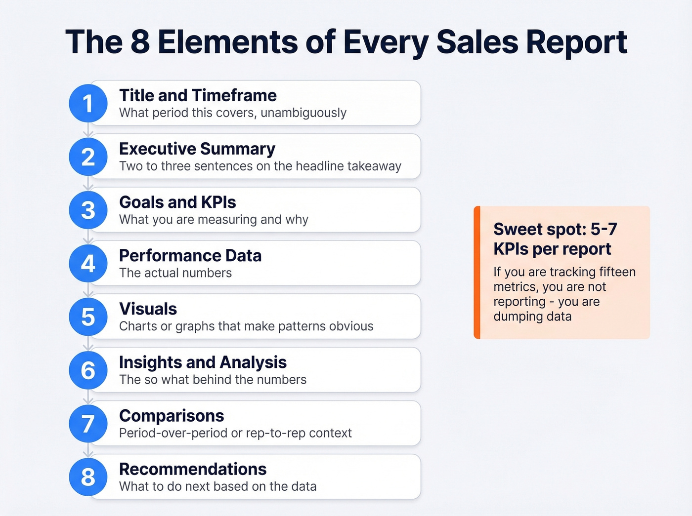
- Title and timeframe - what period this covers, unambiguously
- Executive summary - two to three sentences on the headline takeaway
- Goals and KPIs - what you're measuring and why
- Performance data - the actual numbers
- Visuals - charts or graphs that make patterns obvious
- Insights and analysis - the "so what?" behind the numbers
- Comparisons - period-over-period or rep-to-rep context
- Recommendations - what to do next based on the data
The biggest mistake is including too many metrics. As one r/sales thread put it, most weekly reports are overwhelming data dumps instead of focused KPI snapshots. Five to seven KPIs per report is the sweet spot. If you're tracking fifteen metrics, you're not reporting - you're dumping data.
Numbers without context mislead. "We created 47 opportunities this week" means nothing without knowing the target was 60 and last week was 52. Always pair a metric with its goal and its trend.
To pressure-test your pipeline view, it also helps to track pipeline health metrics alongside stage totals.
If your report is built around stage movement, keep a simple reference for funnel metrics so everyone uses the same math.
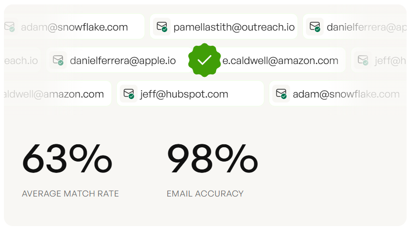
You just read it: bad data going into the CRM is the #1 thing that kills report accuracy. Prospeo's 7-day refresh cycle and 98% email accuracy mean your pipeline reports reflect reality - not stale contacts and bounced emails inflating your numbers.
Clean data in, accurate reports out. It starts at $0.01 per email.
Benchmarks for 2026
Knowing your numbers is step one. Knowing whether they're good numbers is step two. Here are SaaS-specific benchmarks - adjust for your industry, but these give you a baseline.
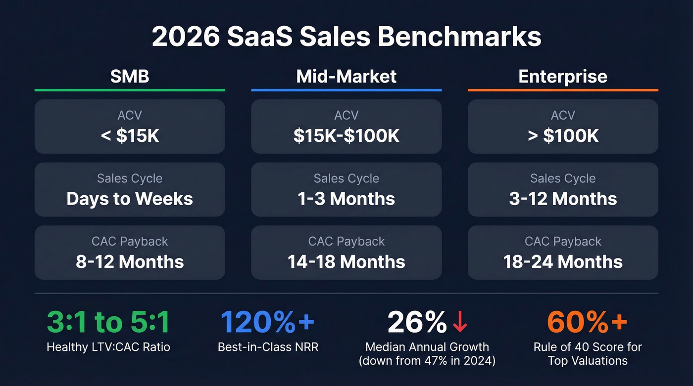
| Metric | SMB | Mid-Market | Enterprise |
|---|---|---|---|
| ACV | < $15K | $15K-$100K | > $100K |
| Sales Cycle | Days-weeks | 1-3 months | 3-12 months |
| CAC Payback | 8-12 months | 14-18 months | 18-24 months |
A healthy LTV:CAC ratio sits between 3:1 and 5:1 - top performers push above 4:1. Median CAC payback across SaaS in 2026 is 15-18 months; elite teams get under 12. Net revenue retention above 120% separates best-in-class from the pack, and companies scoring above 60% on the Rule of 40 command 2-3x higher valuations.
If you want a deeper breakdown of CAC math and what to report, use a consistent cost to acquire customer definition across teams.
Median annual revenue growth has cooled to 26%, down from 47% in 2024. If your board is still benchmarking against 2023 growth rates, your reports should flag that shift explicitly. These benchmarks belong in your monthly and quarterly reports - they turn internal numbers into a story about market position.
How to Build a Sales Report
Here's the process that works, distilled to six steps.
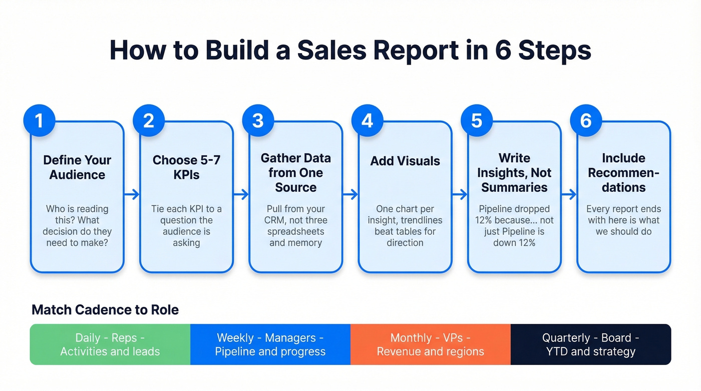
Step 1: Define your audience. A board report and a rep coaching report share almost zero overlap. Start with who's reading and what decision they need to make.
Step 2: Choose 5-7 KPIs. For a weekly manager report, a strong shortlist includes calls made, deals created, pipeline generated, lead response time, and closed-won deals. Tie each KPI to a question the audience is asking.
Step 3: Gather data from one source of truth. Pull from your CRM, not from three spreadsheets and someone's memory. Fragmented data sources are the fastest way to produce reports nobody trusts.
If you're still debating what belongs in the CRM vs. spreadsheets, it helps to look at a few examples of a CRM and how they handle reporting.
Step 4: Add visuals. A trendline beats a table for showing direction. A bar chart beats a paragraph for comparing reps. One chart per insight - no more.
Step 5: Write insights, not summaries. "Pipeline is down 12% week-over-week" is a summary. "Pipeline dropped 12% because we lost two enterprise deals to budget freezes - we need three more Stage 2 opportunities by Friday to stay on track" is an insight. See the difference?
Step 6: Include recommendations. Every report should end with "here's what we should do." Otherwise it's just a history lesson.
Match cadence to role:
| Cadence | Audience | Focus |
|---|---|---|
| Daily | Reps | Activities, leads, deals |
| Weekly | Managers | Team progress, pipeline |
| Monthly | VPs | Revenue, regions, products |
| Quarterly | Board | YTD, forecast, strategy |
If your org runs QBRs, you can map monthly reporting into a tighter QBR meaning cadence without adding extra meetings.
Presenting Reports to Executives
Your VP has three to five minutes of attention for your report. Maybe less.
Lead with conclusions and recommendations first, then supporting evidence. This is the opposite of how most people build reports - data first, conclusion buried on slide 14 - and it's the single biggest improvement you can make. We've watched reps nail this shift and go from "nobody reads my updates" to "the VP forwards my report to the CEO."
Keep the executive view to 5-7 KPIs, each with a one-line explanation, a trend indicator (up, down, flat), and a business impact statement. Think elevator pitch, not earnings call. If a metric needs a paragraph of context to make sense, it's too granular for this audience.
If you want a simple way to tighten the narrative, borrow the structure of sample elevator pitches and apply it to your top-line metrics.
Here's the thing: executives don't distrust your data because the chart is ugly. They distrust it because last quarter's forecast was off by 25%. Accuracy and consistency build credibility over time. No amount of formatting fixes a trust deficit.
7 Mistakes That Destroy Report Accuracy
1. Data dumps without context. Exporting everything your CRM spits out isn't reporting. Pick 5-7 metrics, explain what they mean, cut the rest.
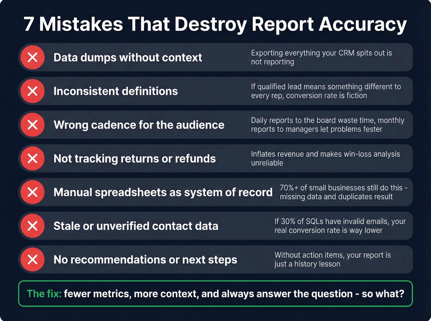
2. Inconsistent definitions. If "qualified lead" means something different to every rep, your conversion rate is fiction. Standardize terminology with written definitions and enforce them during onboarding.
3. Wrong cadence for the audience. Daily activity reports to the board waste everyone's time. Monthly pipeline reports to frontline managers mean problems fester for weeks.
4. Not tracking returns or refunds. This inflates revenue numbers and makes win/loss analysis unreliable. If a deal closes and churns in 30 days, your report should reflect that.
If you sell subscriptions, pair this with a lightweight churn analysis so revenue reporting matches reality.
5. Manual spreadsheets as the system of record. Over 70% of small businesses still track sales in spreadsheets or notebooks. The result: missing data, duplicate entries, and totals that don't reconcile.
6. Stale or unverified contact data. Your conversion rate report says 22% of SQLs become customers. But if 30% of those "SQLs" have invalid email addresses, they were never actually contacted - your real conversion rate is closer to 15%. Pipeline reports built on unverified data are inflated by definition. Tools like Prospeo verify emails at 98% accuracy on a 7-day refresh cycle, so the CRM data feeding your reports reflects reality instead of wishful thinking.
If you’re auditing this problem, start with email bounce rate benchmarks and work backward to list quality.
7. Wrong tool fit. A 5-person team doesn't need Salesforce Enterprise. A 200-person org can't run on Google Sheets. Mismatched tools lead to low adoption, which leads to data gaps, which leads to reports nobody trusts. Skip the enterprise platform until you actually have enterprise complexity.
How AI Changes Reporting in 2026
Reps spend roughly 24 hours per week on admin - data entry, scheduling, follow-ups. For a 50-person sales team, that's approximately $3M in salary spent on non-revenue work based on average sales rep compensation. AI is clawing that time back.
If you're using AI to reduce admin time, it pairs well with tighter sequence management so follow-ups stay consistent.
The shift isn't from manual reports to automated reports. It's from dashboards that summarize to AI that acts: behavior-based lead scoring that updates dynamically, forecasting built from engagement signals and deal velocity, conversation intelligence that analyzes calls for objection patterns, automated flagging of stalled deals before a manager notices. All in production today.
But AI only narrows the forecast error gap if the underlying data is accurate. Garbage in, AI-powered garbage out. Let's be honest - most teams rushing to adopt AI reporting haven't fixed the data quality problems that made their manual reports unreliable in the first place.
Best Tools for Sales Reporting
Salesforce (roughly $25-$330/user/month depending on edition) is the default for mid-market and enterprise. Powerful reporting engine, steep learning curve - budget for admin time or a consultant. If your team will actually use the platform, nothing else matches its depth.
HubSpot vs. Google Sheets - this is the real decision for most growing teams. HubSpot's free CRM includes solid built-in reporting, and Sales Hub paid plans start around $20/user/month at the Starter tier. Google Sheets is free for personal use; business plans run $6-$18/user/month via Workspace. Sheets is more flexible but fragile - one broken formula and your numbers are wrong for weeks before anyone notices. Skip Sheets the moment you have more than five reps. The time you save on debugging alone pays for HubSpot.
For visualization, Tableau runs roughly $15-$75/user/month depending on role, while Power BI has a free tier and paid plans around $10-$20/user/month. Neither replaces the CRM - they're the presentation layer.
If forecasting is a core deliverable, compare your options against dedicated sales forecasting solutions before you commit.
Hot take: most teams over-invest in reporting tools and under-invest in data quality. The fanciest Tableau dashboard is worthless if 30% of your pipeline contacts have bad emails. Fix the data first, then worry about the charts.
Every benchmark in this guide - win rates, conversion rates, CAC payback - falls apart when your CRM is full of outdated contacts. Prospeo enriches your records with 50+ verified data points per contact at a 92% match rate, so your reports tell the truth.
Stop reporting on ghost pipeline. Enrich your CRM today.
FAQ
What is a sales report used for?
A sales report drives decision-making, forecasting, accountability, and rep coaching by giving stakeholders a structured view of performance over a specific period. Teams with structured reporting reduce forecast errors by 20-30%, turning guesswork into reliable revenue projections.
How often should you create one?
Reps need daily activity snapshots. Managers need weekly pipeline reports. VPs review monthly revenue summaries. The board gets quarterly strategic overviews. Match cadence to the decision cycle - a mismatch means either stale data or information overload.
What's the difference between a report and a dashboard?
A report is a static document analyzing a defined period and explaining why results happened. A dashboard is a live interface updating continuously, showing what's happening now. Most teams need both - dashboards for real-time monitoring, reports for the analysis and recommendations that drive action.
How do you fix inaccurate sales reports?
Start with data quality: verify contact records, standardize field definitions across reps, and pull from a single CRM source of truth. We've seen teams discover that 20-30% of their pipeline was phantom - contacts with invalid emails who were never actually reached. Cleaning that up changes every metric downstream.