How to Build a Win Loss Analysis Dashboard That Actually Changes Outcomes
Your VP asks why win rate dropped 8 points last quarter. You pull up Salesforce. The "Loss Reason" field says "Price" on half the deals and "Other" on the rest. Nobody in the room can explain what actually changed, and the win loss analysis dashboard everyone nodded at during the QBR is suddenly useless.
That's not a dashboard problem. It's a data problem disguised as a visualization.
The dashboard isn't the hard part. The data feeding it is. Every guide obsesses over chart types and BI tools while ignoring the fact that most CRM loss reasons are entered by reps who spent three seconds on the field before moving to their next call.
What You Actually Need
A dashboard that drives decisions - not decoration - needs three things most teams skip:
- Mandatory CRM loss reason fields with a governed taxonomy, not five generic dropdown options
- Qualitative buyer interview data layered on top of CRM metrics
- Clean upstream contact data - if your CRM records have decayed, you're analyzing deals where reps were reaching the wrong people entirely (see contact management best practices)
Here's the uncomfortable stat: 60% of sellers are partially or completely wrong about why they lost a deal. Your dashboard is only as reliable as the inputs behind it.
The Business Case
Gartner research points to up to 50% improvement in conversion rates with a well-structured win/loss approach. That's the ceiling, not the average, but even modest gains compound fast across a pipeline (and show up clearly in your pipeline health metrics).
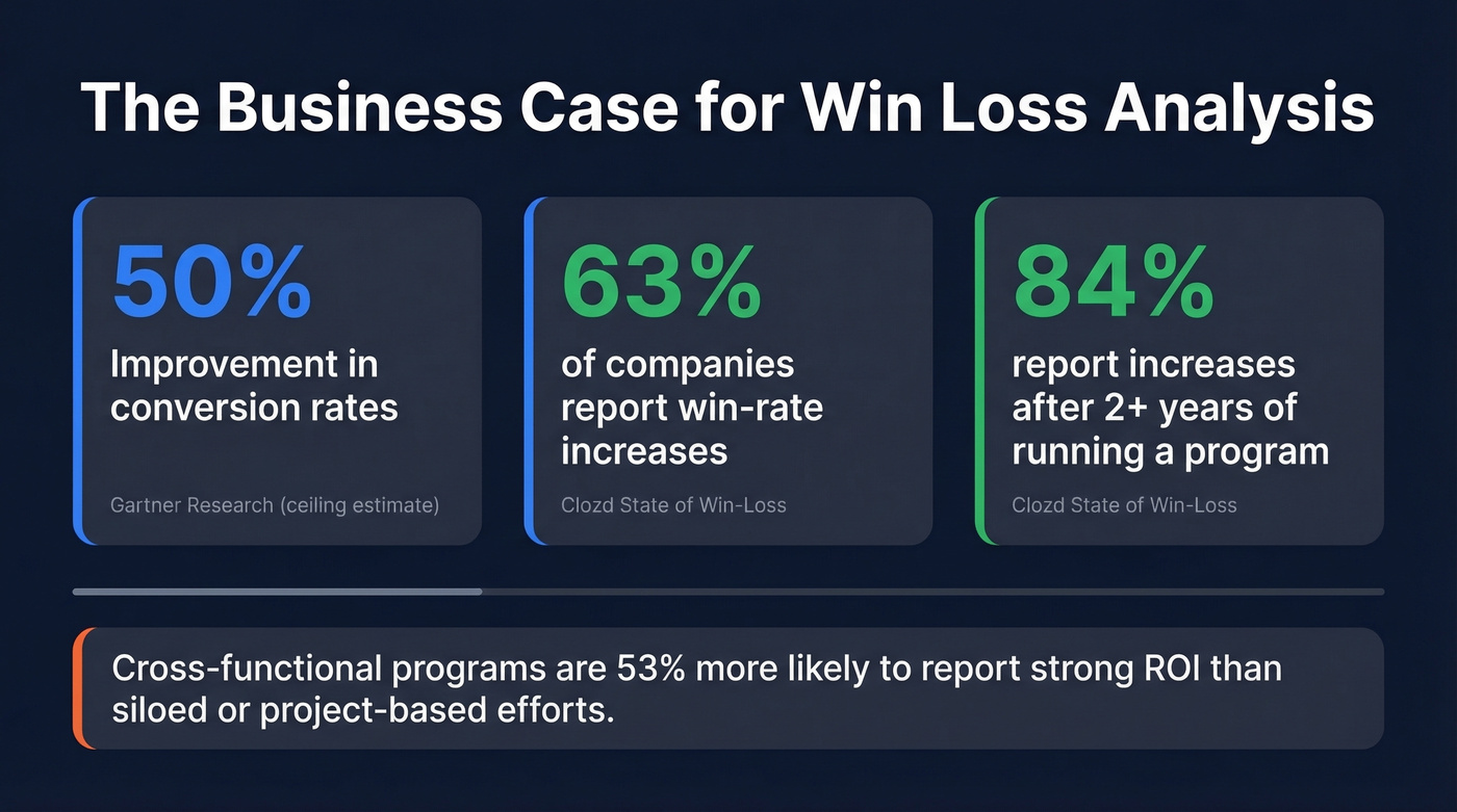
The numbers from Clozd's State of Win-Loss report are more grounded: 63% of companies report win-rate increases from win/loss analysis, and that jumps to 84% for programs running longer than two years. Companies with ongoing, cross-functional programs are 53% more likely to report strong ROI than teams running siloed or project-based efforts.
To make the business case stick at every level, tie your dashboard KPIs to three tiers: corporate goals like market share and CLV, department outcomes like win rate by team and competitive displacement, and program metrics like feedback loop speed and interview completion rate. This hierarchy gives executives a reason to care and gives your team a way to prove impact quarter over quarter.
This isn't a "nice to have" initiative. It's a compounding advantage that gets better the longer you run it.
Core Metrics
Before you pick a single chart type, nail the metrics. Two formulas matter, and they measure different things:
| Metric | Formula | What It Reveals |
|---|---|---|
| Win Rate | Win Rate | Wins / Total Opps | Overall conversion health |
| Win/Loss Ratio | Win/Loss Ratio | Head-to-head competitiveness |
The win/loss ratio explicitly excludes no-decisions and stalled deals, so it tells you how you perform when buyers actually choose. Win rate includes everything - and that distinction matters more than most teams realize.
Track both by count and by amount. A team might win 60% of deals by count but only 40% by revenue, which means they're losing the big ones. That's a completely different problem than low overall conversion, and it demands a different fix (often tied to enterprise B2B sales motion and deal strategy).
One more thing worth flagging: "no decision" is a loss reason, and for many teams it becomes one of the largest categories. If you're not tracking it as a distinct outcome, you're hiding a major leak.
The 8 Charts Worth Building
Each chart earns its spot by driving a specific action - not by looking good in a slide deck.
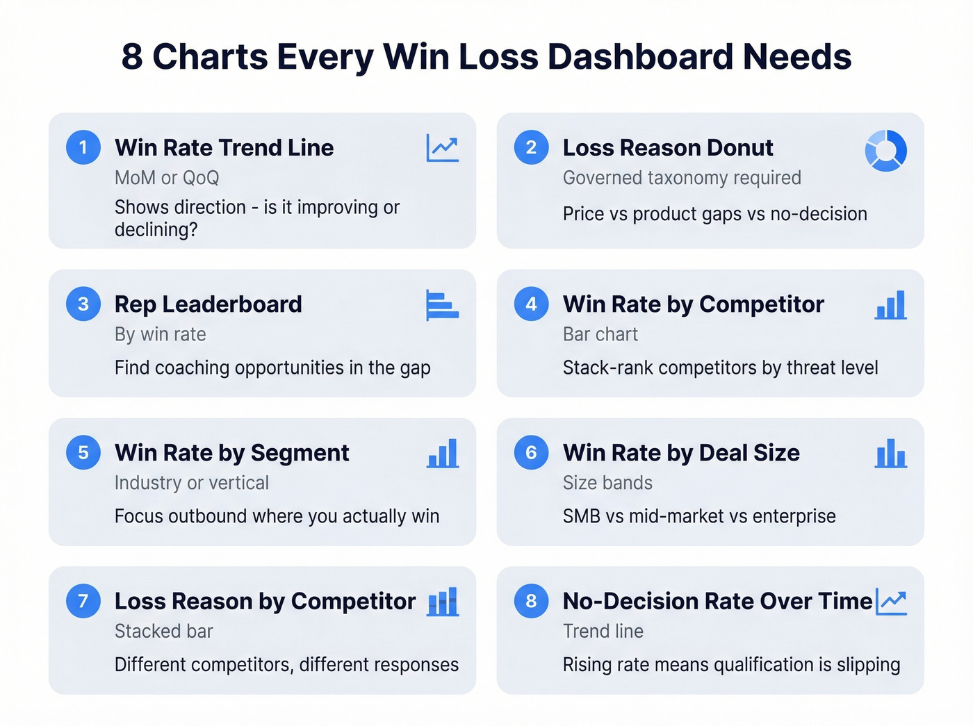
1. Win rate trend line (MoM/QoQ) - the single most important chart. Shows direction. If it's flat or declining, everything else is diagnosis.
2. Donut chart for loss reasons - reveals whether you're losing on price, product gaps, competitive displacement, or no-decision. Requires a governed taxonomy to be useful.
3. Leaderboard by rep/owner - identifies coaching opportunities. The gap between top and bottom performers is where revenue hides (and where sales performance management systems help).
4. Bar chart: win rate by competitor - tells you who you beat and who beats you. Stack-rank competitors by threat level (then operationalize it with sales battle cards).
5. Win rate by industry/segment - shows where your product-market fit is strongest and helps focus outbound targeting on segments where you actually win.
6. Win rate by deal size band - exposes whether you're winning small deals but losing enterprise, or vice versa. Different motions need different playbooks.
7. Loss reason by competitor (stacked bar) - the most underused chart. It shows that you lose to Competitor A on price but Competitor B on features. Completely different responses required.
8. No-decision rate over time - tracks pipeline discipline. A rising no-decision rate means qualification is slipping or sales cycles are stalling (common sales pipeline challenges).
Each chart should answer one question and suggest one action. If it doesn't do both, cut it. As a supplementary metric, consider tracking average stage duration - deals that stall in a specific pipeline stage often reveal process bottlenecks that loss reasons alone won't surface (see funnel metrics).
91% of CRM data is incomplete, and your win loss dashboard inherits every bad record. Prospeo refreshes contact data every 7 days with 98% email accuracy - so your pipeline analysis reflects real buyers, not departed employees and bounced emails.
Stop building dashboards on data that decayed six weeks ago.
Why Most Dashboards Fail
91% of CRM data is incomplete, and 70% becomes inaccurate within a year. So when you build a beautiful visualization on top of a CRM where half the loss reasons say "Other" and a third of the contact records have bounced emails, you're visualizing noise.
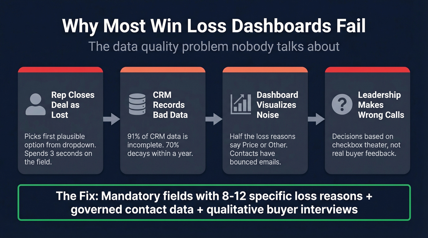
Let's be honest about what happens in practice. CRM "Loss Reason" fields with five generic options are checkbox theater. A rep closes a deal as lost, picks the first plausible option from a dropdown, and moves on. That data point is now a permanent input to your dashboard. Multiply that across hundreds of opportunities and you've got a chart that looks authoritative but means nothing.
This matches what we've seen in PMM communities - teams consistently say CRM fields "don't get updated consistently" and insights end up scattered across Excel files and Slack threads.
The fix has two layers. First, make loss reason fields mandatory via Salesforce validation rules when moving an opportunity to Closed Lost, and build a taxonomy with 8-12 specific, mutually exclusive options instead of vague categories.
Second, govern your upstream contact data. If your CRM contacts have decayed - wrong titles, bounced emails, departed employees - your dashboard is analyzing deals where reps were prospecting ghosts. Tools like Prospeo, which refreshes contact data every 7 days with 98% email accuracy, prevent the kind of silent decay that makes dashboards unreliable over time. Without clean inputs, even the best-designed win loss analysis dashboard is decoration.
Collecting Qualitative Data
CRM fields tell you what happened. Buyer interviews tell you why. You need both.
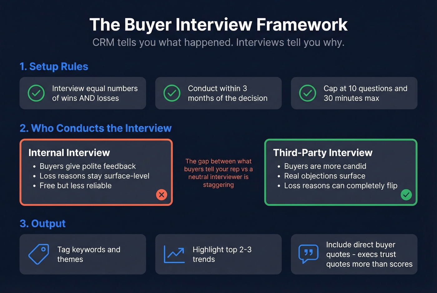
The Kompyte framework offers solid guardrails: interview equal numbers of wins and losses, ideally within three months of the decision. Cap interviews at 10 questions and 30 minutes - anything longer and participation drops off a cliff.
Use a third party for interviews whenever budget allows. Buyers are more candid with a neutral interviewer than with the rep who just lost their deal. Internal interviews tend to surface polite feedback; third-party conversations surface the real objections. In our experience, the gap between what a buyer tells your rep and what they tell a neutral interviewer is staggering - we've seen loss reasons completely flip once a third party is involved.
Once you've got interview data, follow Klue's template approach: tag keywords and themes, highlight the top 2-3 trends, and include direct buyer quotes. Executives trust quotes more than aggregated scores. Also track the "Competitive Revenue Gap" - the total revenue each competitor is taking from you - to prioritize which competitive battles deserve the most attention (a core part of competitive intelligence strategy).
Turning Insights into Reports
A live dashboard surfaces patterns in real time, but stakeholders outside RevOps and PMM often need structured win loss reports they can act on. Distill your dashboard findings into a quarterly report that includes the top three loss reasons by revenue impact, competitive displacement trends, and direct buyer quotes. These reports bridge the gap between a live dashboard and the executive summary your leadership team actually reads before making budget or roadmap decisions.
Skip this step if your entire leadership team already lives in your BI tool daily. But that's rare - most execs want a two-page summary, not a login.
Tools and Platforms
DIY Options
You don't need a $30K+/year platform to start. Salesforce dashboards can handle the 8 charts above if you've got the right fields configured (and it helps to understand Salesforce pricing tradeoffs as you scale). Looker Studio is free and connects to most data sources. Power BI Pro runs $10/user/month and is the natural choice for Microsoft shops. Coupler.io is worth a look as a connector layer - its Salesforce win/loss dashboard template segments results by industry, sales owner, lead source, and geography.
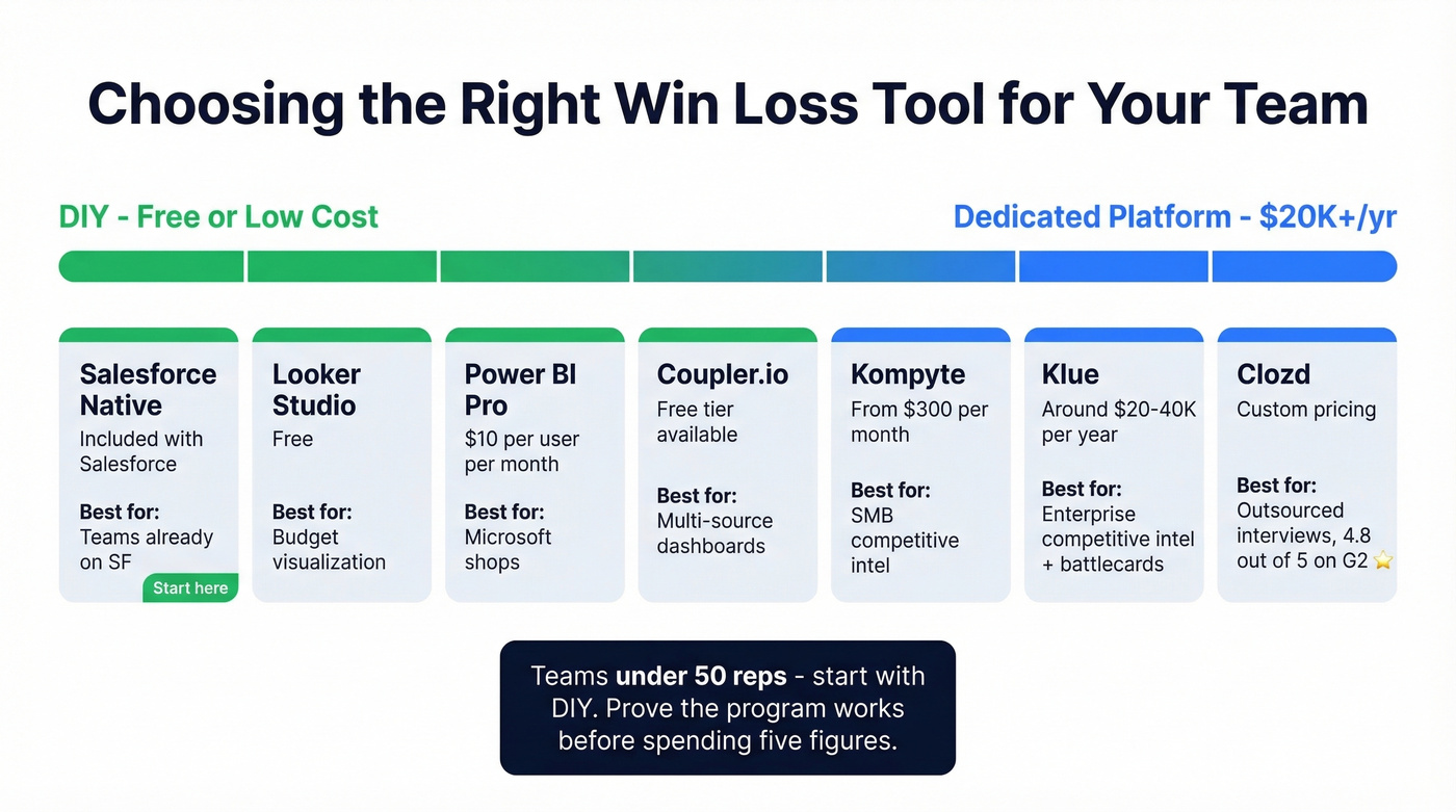
Here's the thing: most teams under 50 reps don't need a dedicated win/loss platform. A well-configured Salesforce dashboard with quarterly buyer interviews will get you 80% of the value. Save the five-figure spend until you've proven the program works with free tools first.
Dedicated Platforms
Clozd is the specialist, carrying a 4.8/5 on G2 with 281 reviews. It syncs with Salesforce and outsources the entire interview process. Users consistently praise the unbiased feedback and the mix of quantitative data with qualitative quotes. The main complaint: reporting feels clunky, and several users export to Excel for presentations.
Klue is the better fit for teams that want a competitive battlecard platform that also does win/loss, rather than a pure win/loss tool. Crayon and Kompyte round out the category - Kompyte being the most accessible entry point for SMBs.
| Tool | Type | Starting Price | Best For |
|---|---|---|---|
| Salesforce (native) | DIY | Included | Teams already on Salesforce |
| Looker Studio | DIY/BI | Free | Budget visualization |
| Power BI Pro | BI | $10/user/mo | Microsoft shops |
| Coupler.io | Connector | Free tier available | Multi-source dashboards |
| Kompyte | Platform | From $300/mo | SMB competitive intel |
| Klue | Platform | ~$20-40K/yr | Enterprise competitive |
| Clozd | Platform | ~$30-60K/yr | Outsourced programs |
| Crayon | Platform | ~$25K/yr | CI-focused teams |
Operating Cadence
Building the dashboard is step one. Running the program is where most teams stall.
Klue's maturity model maps the progression from sales-sourced to siloed to integrated to action-oriented. Most teams are stuck at stage one or two, where a single person pulls CRM reports quarterly and nobody acts on the findings. The goal is stage four, where win/loss insights flow into product roadmaps, competitive positioning, and sales enablement in near-real-time. Conversation intelligence tools like Gong and Chorus can supplement interviews by surfacing patterns across recorded calls.
Ownership matters enormously. This should live with PMM or RevOps - not sales. Sales teams are too close to the deals to run an unbiased program, and they've got quota to chase. Quarterly review cadence is the minimum; monthly is better once the program matures (especially if you're tightening sales process optimization).
Outsourced programs show 70% satisfaction with feedback quality versus 34% for in-house. That gap is massive. Start in-house if budget is tight, but plan the transition to outsourced interviews as the program proves its value.
Win rate by segment only matters if your reps were reaching the right people. When 70% of CRM data goes stale within a year, your loss reasons are analyzing deals built on ghost contacts. Prospeo enriches records with 50+ data points at a 92% match rate - for $0.01 per email.
Fix the inputs and your win loss analysis finally tells the truth.
FAQ
What's a good win rate for B2B sales?
Most B2B teams sit around 20-40% depending on deal complexity and qualification rigor. The number matters less than the trend - a team improving from 22% to 28% is in better shape than one sitting flat at 35%. Track direction quarterly, not snapshots.
Should I outsource win/loss interviews?
Yes, if budget allows. Outsourced programs show roughly 70% satisfaction with feedback quality versus 34% for in-house efforts. Buyers are far more candid with a neutral third party. Start in-house if budget is tight, but plan to outsource as the program matures.
What should a win loss analysis dashboard include?
At minimum: win rate trend over time, loss reasons by category, win rate by competitor, and win rate by deal size. The 8-chart framework above covers the essentials. The chart most teams miss is loss reason broken down by competitor - it reveals you lose to different competitors for completely different reasons.
How do I keep dashboard data clean enough to trust?
Make loss reason fields mandatory via validation rules - no exceptions. Audit contact data quarterly at minimum. A 7-day data refresh cycle prevents the 70% annual decay that makes dashboards unreliable. Clean inputs aren't optional; they're the foundation everything else sits on.