Data Quality in 2026: How to Define, Measure, and Improve It
Most data quality work isn't fancy tooling. It's getting teams to agree on what "correct" means, then making sure someone actually owns the fix when reality disagrees. That's why dashboards get side-eyed and AI projects stall: nobody can tell you what "good" is, how it's measured, or who gets paged when it breaks.
The win in 2026 is simple: define quality for the use case, measure it like uptime, and run it like an ops program.
What you need (quick version)
This is the minimum viable data quality system. It's intentionally boring. Boring survives production.

- Pick Tier-1 datasets (the ones that break the business).
- Revenue + billing reporting
- Customer/account master (and the IDs that tie systems together)
- Define CDEs (Critical Data Elements) per Tier-1 dataset.
- 10-30 fields max per dataset
- Each CDE has: definition, allowed values, owner, and "what breaks if wrong"
- Write "good enough" targets per dimension (numbers, not vibes).
- Accuracy, completeness, validity, consistency, uniqueness, timeliness, fitness for purpose
- Instrument checks and publish a scorecard.
- Daily for Tier-1, weekly for Tier-2
- Red/yellow/green with owners and due dates
- Run a weekly defect triage with owners.
- One queue, one prioritization rule, one escalation path
- Treat quality like reliability: SLOs + error budgets.
- "99% of Tier-1 tables updated within 24h"
- "<0.5% duplicates in customer master"
- Prevent repeats with data contracts + change management.
- Contract first, deploy second
If you do only 3 things this month:
- Tier-1 datasets + CDEs (stop boiling the ocean)
- SLOs + a scorecard (make quality visible and comparable)
- Weekly defect triage with owners (quality improves when someone's on the hook)
What is data quality? Definition: "fit for purpose," not "perfect"
If you're asking what data quality is, the most useful answer is: it's not "clean data." It's data you can safely use for a specific decision or workflow, which is why quality is about reducing operational risk, not chasing perfection.
IBM's definition is a solid baseline: data quality is how well a dataset meets criteria for accuracy, completeness, validity, consistency, uniqueness, timeliness, and fitness for purpose. IBM's overview: https://www.ibm.com/topics/data-quality
The trap is aiming for "perfect." Perfect's economically irrational: the last few percentage points cost the most, slow delivery, and usually don't change outcomes.
Two "fit for purpose" examples (with tolerances) that make this real:
- Billing feed (high risk):
- Tolerance: 0 duplicate invoices, 0 missing invoice IDs, and freshness within the billing run window (for example, 99.9% within 2 hours).
- Why: one bad record becomes a support fire, revenue leakage, or compliance exposure.
- Marketing list (medium/low risk):
- Tolerance: you can live with 10-20% missing phone numbers if email is valid; you can also accept a slower refresh (weekly) if the campaign cadence is weekly.
- Why: the blast radius is deliverability and efficiency, not financial correctness.
Quality's contextual. A fraud model might accept late-arriving events (with a defined window) but can't accept schema drift. A routing workflow can tolerate a missing "industry" field but can't tolerate duplicate accounts.
Mini callout: "Fit for purpose" is a contract, not a slogan
If you can't answer these three questions, you don't have a definition. You've got a hope.
- Purpose: What decision or system uses this data?
- Blast radius: What breaks (and who feels it) when it's wrong?
- Tolerance: What's the acceptable error rate and latency?
Once those are explicit, the rest becomes engineering and operations.
The core dimensions of data quality (and what "good" looks like)
Most teams track the "classic six" dimensions and forget the one that matters most: fitness for purpose. Fitness is the dimension that stops you from spending months optimizing the wrong thing.

Below is a practical table you can steal. The "default targets" are sane starting points for Tier-1 datasets; adjust based on risk and cost.
| Dimension | Plain-English meaning | Example failure | Typical default target |
|---|---|---|---|
| Accuracy | Values match reality | Wrong ARR on account | >=98% correct |
| Completeness | Required fields filled | Missing country/state | >=95% filled |
| Validity | Values follow rules | Bad email format/date | >=98% valid |
| Consistency | Same meaning everywhere | "SMB" != "SMB" by system | >=97% consistent |
| Uniqueness | No unintended duplicates | 2 customer IDs per org | >=99% unique |
| Timeliness | Updated when needed | Yesterday's pipeline | >=99% <24h (Tier-1) |
| Fitness for purpose | Works for the use case | "Accurate" but unusable for routing | Pass use-case SLO |
A few opinionated notes from real implementations:
- Timeliness is the silent killer. A dataset can be "accurate" and still useless if it's late. I've watched teams celebrate 99% accuracy while Sales is calling last quarter's champions because enrichment lags by weeks.
- Uniqueness is where CRMs go to die. Duplicates don't just annoy people. They multiply downstream errors (routing, attribution, forecasting).
- Fitness for purpose is your escape hatch. It lets you say: "This dataset's high quality for analytics, but it's not certified for automation."
You just read about SLOs, scorecards, and timeliness as a silent killer. Prospeo solves the input layer: 300M+ profiles verified through a 5-step process, 98% email accuracy, and a 7-day refresh cycle - while the industry average sits at 6 weeks. Your data quality metrics start with your data source.
Fix data quality at the source - not in a cleanup sprint.
Data quality vs data integrity vs data profiling vs observability
People mix these terms up, then buy the wrong tool or assign the wrong owner. Here's the clean separation:

| Concept | What it is | What it's for | What it's not |
|---|---|---|---|
| Data quality | Data meets defined criteria for a use case | Trust + usability | Not just schema constraints; includes business correctness and timeliness |
| Data integrity | Correctness + protection from corruption (often with a security lens) | Prevent corruption and unauthorized change | Not a full DQ program or business-definition alignment |
| Data profiling | Examining data distributions and relationships | Find issues fast | Not ongoing monitoring or ownership |
| Data observability | Monitoring data "health signals" over time | Detect incidents quickly | Not a guarantee that values are correct for your business logic |
Data profiling is how you find problems; it doesn't keep them from coming back. Observability is the ops layer: it tells you something changed and helps you catch incidents early.
Atlan has a useful framing for observability signals (freshness, volume, schema, lineage, distribution): https://atlan.com/data-observability/
Use/skip guidance that saves time:
- Use data profiling if you're onboarding a new source, migrating systems, or inheriting a messy warehouse.
- Skip profiling-as-a-project if you don't have owners and thresholds. You'll generate a 40-page report and fix nothing.
- Use observability if you have frequent breakages, lots of pipelines, or stakeholders keep finding issues before data teams do.
- Skip observability as a substitute for quality. It'll catch anomalies; it won't tell you whether "ARR" matches your finance definition.
Why data quality matters in 2026 (analytics, operations, and AI readiness)
Bad data used to be "annoying." In 2026, it's expensive, operationally risky, and it blocks AI. When teams can't trust inputs, they slow decisions, add manual checks, and ship automation that breaks.

Gartner puts the average annual cost of poor data quality at $12.9M (2020 research): https://www.gartner.com/en/data-analytics/topics/data-quality
The AI angle is even more brutal. Precisely + Drexel LeBow's global research (565+ data/analytics professionals, first half of 2024) found:
- Only 12% say their data is sufficient quality and accessibility for effective AI implementation.
- 67% don't completely trust their data for decision-making.
- 62% cite lack of data governance as the primary challenge inhibiting AI initiatives.
Here's the part that explains why "we have governance" still doesn't fix it: 71% report having a governance program, yet 49% say they lack tools to automate quality checks, and definition inconsistency (45%) keeps quality from improving.
One modern failure mode deserves its own callout: semantic drift. The new problem often isn't missing data. It's meaning drift across tools and teams. "Active user," "qualified lead," and "churn" quietly diverge between product analytics, finance, and CRM; your pipelines keep running, your dashboards keep refreshing, and the business still makes contradictory decisions because the definitions no longer match.
Hot take: if your AI initiative starts before your Tier-1 definitions and SLOs exist, you're not building AI. You're automating confusion.
How to measure data quality: KPIs, formulas, thresholds, and a scorecard
Most teams measure quality like a one-off audit. The teams that win measure it like reliability: repeatable checks, clear thresholds, and a scorecard with owners.
Step 1: Separate measure vs metric vs KPI vs threshold
This vocabulary matters because it stops endless debates.
- Measure: a raw count or observation (for example, "null emails = 1,248").
- Metric: a calculated value (for example, "email completeness = 94.2%").
- KPI: a metric tied to a target (for example, "Tier-1 completeness >=95%").
- Threshold: the tolerance that flips status (for example, "warn <95%, fail <92%").
Step 2: Start with CDEs (Critical Data Elements)
Pick the fields that drive decisions and automation. For each CDE, write:

- Definition (business meaning)
- Allowed values / format
- Source of truth
- Owner (a human)
- Check(s) + thresholds
- SLO (latency/refresh expectation)
The fastest way to get traction is limiting to 10-30 CDEs per Tier-1 dataset. Anything bigger becomes theater.
Step 3: Use standard formulas (then customize)
These formulas are standard and widely used; Acceldata summarizes them cleanly: https://www.acceldata.io/blog/data-quality-metrics
| Dimension | KPI formula | Example target (Tier-1) |
|---|---|---|
| Accuracy | (Accurate / Total) x 100 | >=98% |
| Completeness | (Populated required / Total required) x 100 | >=95% |
| Consistency | (Consistent across sources / Total compared) x 100 | >=97% |
| Timeliness | (Updated in window / Total) x 100 | >=99% <24h |
| Validity | (Valid values / Total tested) x 100 | >=98% |
| Uniqueness | (Distinct / Total) x 100 | >=99% |
Two upgrades we've found worth doing early:
- Severity levels for checks (warning/error/fatal). You score "quality" as a % of passed checks, but you don't let low-risk warnings tank the KPI. Warnings are "outside contract but expected," so they don't destroy trust in the scorecard.
- Sampling rules for expensive checks. You don't need to validate every row to catch systemic issues, and you'll keep your warehouse bills and runtimes sane.
Step 4: Set thresholds by risk class (so you stop arguing)
Teams waste months debating whether the "right" completeness target is 95% or 97%. The better question is: what happens if we're wrong? Use a risk rubric and move on.
| Risk class | Typical datasets | Default stance | Example thresholds |
|---|---|---|---|
| High (money/legal/safety) | Billing, payouts, tax, entitlement, audit logs | Block bad data | Completeness >=99.5% (fatal), Uniqueness >=99.9% (fatal), Timeliness SLO tied to business run |
| Medium (customer ops/revenue ops) | Routing, lead/contact, renewals, support SLAs | Alert fast, fix within SLA | Completeness >=97% (error), Validity >=98% (error), Timeliness >=99% within 24h (error) |
| Low (exploration/BI) | Ad hoc analysis, experiments | Trend + educate | Completeness >=90% (warning), Timeliness weekly (warning), schema drift alerts only |
This is also where you decide what happens on failure:
- Fatal: stop the pipeline / block the downstream job.
- Error: alert + open a ticket automatically.
- Warning: log + trend + review in weekly triage.
Step 5: Publish a scorecard people can actually use
If your scorecard doesn't show ownership and recency, it's just a report.
Here's a scorecard layout that works:
| Dataset | CDE | Check | Threshold | Owner | SLO | Last run | Status |
|---|---|---|---|---|---|---|---|
| Accounts | billing_country | Completeness | >=99% | Data owner | Daily 06:00 | 2026-02-17 02:10 UTC | Green |
| Events | event_time | Timeliness | >=99% <2h | Custodian | 15 min | 2026-02-17 02:15 UTC | Yellow |
| Contacts | Validity | >=98% | Steward | Daily | 2026-02-17 02:05 UTC | Red |
Put it where stakeholders already look (BI home, a shared Slack channel, the ticketing dashboard). If it lives in a forgotten wiki, it doesn't exist.
Scorecard anti-patterns (the ones that kill adoption)
- 100+ metrics with no owners. If nobody's named, nothing gets fixed.
- A single "DQ score" with no drill-down. People need to see which check failed and what changed.
- Static monthly reporting. Quality's operational. Monthly is a post-mortem, not prevention.
- No "last run" timestamp. A green scorecard that hasn't run in 10 days is worse than red. It's lying.
- All alerts are equal. If everything pages, nothing pages. Severity's non-negotiable.
Worked example: 3 checks for one dataset (SQL/pseudocode you can adapt)
Assume a Tier-1 table: crm_contacts with CDEs email, account_id, updated_at. Here are three checks that map directly to completeness, validity, and uniqueness.
1) Completeness check (email not null)
-- Completeness: % of records with email populated
SELECT
  100.0 * SUM(CASE WHEN email IS NOT NULL AND email <> '' THEN 1 ELSE 0 END) / COUNT(*) AS email_completeness_pct
FROM crm_contacts
WHERE is_active = TRUE;
- Thresholds: Green >= 95%, Yellow 92-95%, Red < 92%
- Scorecard mapping: if
email_completeness_pct = 93.4, status = Yellow.
2) Validity check (email format + basic hygiene)
-- Validity: % of populated emails that match a basic pattern
SELECT
  100.0 * SUM(CASE WHEN REGEXP_LIKE(LOWER(email), '^[a-z0-9._%+-]+@[a-z0-9.-]+\.[a-z]{2,}$') THEN 1 ELSE 0 END)
  / NULLIF(SUM(CASE WHEN email IS NOT NULL AND email <> '' THEN 1 ELSE 0 END), 0) AS email_validity_pct
FROM crm_contacts
WHERE is_active = TRUE;
- Thresholds: Green >= 98%, Yellow 96-98%, Red < 96%
- Practical note: keep this regex simple; deep validation belongs in verification/enrichment, not in your warehouse check.
3) Uniqueness check (duplicate "natural key")
Pick a key that reflects your business rule. For contacts, a common rule is "one active contact per (account_id, email)."
-- Uniqueness: % of rows that are not part of a duplicate group
WITH keyed AS (
  SELECT account_id, LOWER(email) AS email_norm
  FROM crm_contacts
  WHERE is_active = TRUE AND email IS NOT NULL AND email <> ''
),
dupes AS (
  SELECT account_id, email_norm, COUNT(*) AS c
  FROM keyed
  GROUP BY 1,2
  HAVING COUNT(*) > 1
)
SELECT
  100.0 * (1 - (SELECT COALESCE(SUM(c),0) FROM dupes) / (SELECT COUNT(*) FROM keyed)) AS uniqueness_pct;
- Thresholds: Green >= 99%, Yellow 98-99%, Red < 98%
- Action on Red: open a dedupe ticket to the CRM owner; duplicates are rarely "a data team fix" alone.
Rolling up to a dataset status:
- If any fatal check is Red -> dataset status Red.
- Else if any error check is Red/Yellow -> dataset status Yellow.
- Else -> Green.
That roll-up rule is what turns "metrics" into an operational system.
Concrete example: contact-data quality (where metrics hit revenue)
Contact data is the cleanest "DQ 101" dataset because the outcome is immediate: bounces, spam placement, and connect rates.
Here's a scenario we've seen more than once: a team ships a new enrichment workflow, outbound volume goes up, and two weeks later deliverability falls off a cliff. Everyone blames copy. The real culprit is stale and duplicate contacts getting re-uploaded, which quietly spikes bounces and drags your domain reputation down.
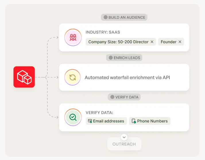
Tools like Prospeo help because they turn fuzzy dimensions into measurable targets you can actually run: 98% verified email accuracy, a 7-day data refresh cycle, and automatic duplicate removal. That refresh cadence matters because stale contact data wrecks outbound performance long before anyone says the words "data quality." If you want a concrete workflow surface area, start here: https://prospeo.io/b2b-data-enrichment
For a RevOps team, that means your scorecard can include checks like: "valid email rate >=98%," "records refreshed <=7 days," and "duplicate contacts <=1%."
DQ in practice: incidents, data downtime, and SLOs (DQOps)
Quality becomes real when it breaks. That's why modern teams run DQ like incident management.
Monte Carlo's survey with Wakefield Research is one of the clearest benchmark sets (200 data professionals, March 2023): https://www.businesswire.com/news/home/20230502005377/en/Data-Downtime-Nearly-Doubled-Year-Over-Year-Monte-Carlo-Survey-Says
Benchmarks worth stealing for your own program targets:
- Monthly incidents increased 59 (2022) -> 67 (2023)
- Average time to resolution hit 15 hours
- 31% of revenue was impacted by data issues
- 74% said stakeholders find issues first "all or most of the time"
- 68% reported time-to-detect (TTD) of 4+ hours
That last stat is the giveaway: detection is the first lever. If it takes half a day to notice a broken pipeline, you're not doing "data quality." You're doing archaeology.
The north-star KPI: data downtime
A simple operational metric beats 20 vanity charts:
data downtime = incidents x TTD x TTR
- Incidents: count of real breakages (not planned changes)
- TTD: time to detection
- TTR: time to resolution
If you only improve one thing, improve TTD. Faster detection shrinks blast radius and prevents the "everyone loses trust" spiral.
SLOs and error budgets for data
Treat Tier-1 datasets like services:
- SLO: "99% of runs complete by 08:00 local time"
- Error budget: "We can miss 1 day per quarter before escalation"
When the error budget is burned, you stop shipping new features and fix reliability. That's how software teams stay stable; data teams deserve the same discipline.
How to run a data quality program (operating model + weekly cadence)
Real talk: programs fail when they're "owned by everyone." That's another way of saying "owned by no one."
The model that works is federated: shared standards and tooling, but domain teams own their data products and fixes. Central governance can set policy; it can't keep every dataset correct day-to-day, and it definitely can't keep up with the pace of definition changes once you have multiple systems feeding the same metrics.
One sentence that saves a lot of pain: the team that benefits from the data doesn't automatically own the data.
RACI-style role mapping (simple and enforceable)
Use these roles as your backbone:
- Data governance council (sets standards, priorities, escalation)
- Data product owner (value/usability, backlog, acceptance criteria)
- Data owner (accountability, risk, approves changes, sets targets)
- Data steward (definitions, triage, defect queue health)
- Data custodian / IT (pipelines, platforms, monitoring, implements fixes)
A practical RACI for common activities:
| Activity | Council | Product owner | Data owner | Steward | Custodian/IT |
|---|---|---|---|---|---|
| Define CDEs | C | A | A | R | C |
| Set thresholds/SLOs | C | A | A | R | R |
| Build checks | I | C | C | C | R |
| Triage defects | I | A | A | R | R |
| Approve logic changes | C | R | A | C | C |
| Publish scorecard | I | A | C | R | R |
(A = accountable, R = responsible, C = consulted, I = informed)
Decision rights (the part most org charts dodge)
To keep the program from turning into endless debate, make decision rights explicit:
- Council owns: certification criteria (what "Tier-1" means), minimum dimensions to measure, escalation triggers (error budget burn), and exception policy (who can approve temporary waivers).
- Domain data owners own: thresholds for their datasets (within council guardrails), prioritization of fixes vs features, and acceptance criteria for definition changes.
- Custodians own: implementation details (pipelines, monitoring, alert routing) and reliability work that reduces TTD/TTR.
This is where programs either become operational, or become a slow-moving committee that produces beautiful docs and zero fixes.
Weekly cadence agenda (30-45 minutes, no fluff)
Run one meeting. Same time every week. Same artifact (the scorecard).
- Scorecard review (10 min): what's red/yellow, what's changed
- Top defects triage (15 min): severity, blast radius, root cause
- Prioritize fixes (10 min): assign owners + due dates
- Decisions/exceptions (5 min): approve temporary thresholds or waivers
- Prevention actions (5 min): contract updates, new checks, change management
The goal isn't to "talk about quality." It's to close defects and prevent repeats.
What checks to implement first (and how to avoid false positives)
If you start with 200 complex rules, you'll drown in noise. Great Expectations' maturity progression is the right shape.
Stage 1: Basic validation (fast wins)
- Null checks on required fields
- Type/format checks (dates, emails, enums)
- Range checks (non-negative revenue, plausible timestamps)
Stage 2: Relationship consistency (stop silent corruption)
- Referential integrity (foreign keys exist)
- Cross-table reconciliation (orders sum to invoices)
- Duplicate detection across keys
Stage 3: Business rule alignment (where quality becomes "real")
- Domain constraints (status transitions)
- Custom SQL expectations
- Contract-based checks tied to upstream producers
Pitfalls that create false positives (and how to avoid them):
- Performance: run heavy checks less frequently, or sample large tables.
- Rule complexity: break rules into smaller checks so failures are diagnosable.
- Timing tolerances: add windows for late-arriving data so you don't page people for normal latency.
I've watched teams turn off monitoring entirely because it cried wolf for two weeks straight. That one's on us as practitioners: if alerts don't mean something, people stop listening.
Standards: ISO 8000 as a common language (and why integrity controls aren't enough)
If you work in regulated environments, or you just want a common language that survives org changes, ISO 8000 is worth knowing.
ISO 8000-1:2022 ("Data quality - Part 1: Overview") lays out the scope of the ISO 8000 series: principles of information/data quality, the path to data quality, the structure of the series, and how it relates to other standards. The responsible committee is ISO/TC 184/SC 4.
The differentiator that matters in 2026: ISO 8000 can be run like a quality management system loop, aligned with the same "define -> measure -> correct -> prevent" logic people recognize from ISO 9000-style QMS. That framing is especially strong in regulated industries, where guidance has been explicit for years: data integrity controls don't guarantee quality for a specific intended use, because you can lock down access, log every change, validate schemas, and still have "correctly stored" data that's semantically wrong for the decision.
A useful reference point for the integrity-vs-quality distinction in regulated contexts is the OECD's guidance on data integrity: https://www.oecd.org/en/publications/good-practice-guidance-on-data-integrity-in-regulatory-decision-making_5a2e5c0e-en.html
Why data quality programs fail (and how to fix the real cause)
Most failures look like tooling problems. They're usually ownership and change-management problems.
Here are the patterns we see repeatedly:
Symptom: "Quality suddenly got worse for no reason."
- What people actually say: "Nothing changed... except the business redefined 'active' and nobody told the warehouse team."
- Root cause: Business logic changed and the data contract didn't.
- Fix: Treat logic as a product change. Version definitions, publish release notes, and require contract updates before deploy.
Symptom: "We do QA, but issues still slip."
- What people actually say: "We compared screenshots for two hours, shipped it, and Finance still found a mismatch the next morning."
- Root cause: Manual screenshot QA is a feel-good ritual. It doesn't test reconciliation, edge cases, or late-arriving data.
- Fix: Replace screenshots with automated checks + reconciliation queries + SLO monitoring. Humans review exceptions, not pixels.
Symptom: "Everyone agrees quality matters, nothing gets fixed."
- What people actually say: "We had five teams in the thread and nobody could approve the change."
- Root cause: Role confusion (producer vs engineer vs analyst vs business).
- Fix: Assign a data owner per Tier-1 dataset and make acceptance criteria explicit. The steward runs the queue; the owner approves tradeoffs; the custodian implements.
Symptom: "We have a scorecard, but nobody looks at it."
- Root cause: No link to outcomes (revenue, ops, customer impact).
- Fix: Tie KPIs to incidents and business metrics. Review the scorecard in the same forum where priorities are decided.
Symptom: "Everything is red, so we ignore it."
- Root cause: Thresholds are unrealistic and alerts are noisy.
- Fix: Start with a small set of Tier-1 checks, add severity levels, and tune timing tolerances. Earn trust before expanding coverage.
If you take one lesson from all of this: data quality is a product discipline with an ops heartbeat. Tools help, but ownership wins.
FAQ about data quality
What is data quality and why is it important?
Data quality is the degree to which data is accurate, complete, valid, consistent, unique, timely, and fit for a specific purpose. It matters because low-quality inputs create broken reporting and risky automation, and they slow AI adoption; Gartner estimates the average annual cost of poor quality at $12.9M.
What are the most important data quality dimensions to track first?
Start with timeliness, completeness, and uniqueness because they break workflows fastest and are easy to measure daily. A practical baseline is >=95% completeness on required fields, >=99% freshness within 24 hours for Tier-1 tables, and <=1-2% duplicates on your customer/account master.
What's the difference between data quality and data integrity?
Data quality is about usability for a decision (accuracy, completeness, validity, consistency, uniqueness, timeliness, and fitness for purpose), while data integrity is about preventing corruption and enforcing core correctness controls. In regulated environments, integrity controls can be perfect and you can still have semantically wrong definitions (for example, "ARR") that make the dataset unusable.
What's a good free way to improve contact data quality for outbound?
A strong free starting point is to verify emails, dedupe, and refresh records on a fixed cadence before pushing to your CRM or sequencer. Prospeo's free tier includes 75 emails plus 100 Chrome extension credits per month, and it's built around 98% verified email accuracy and a 7-day refresh cycle, which are useful targets to mirror in your own scorecard.
Duplicates, stale records, and bad emails are the exact CDE failures this article warns about. Prospeo's automatic deduplication, catch-all verification, and spam-trap removal are built to keep your CRM clean - at $0.01 per email with a 92% API match rate.
Bounce rates under 4% aren't aspirational. They're standard with Prospeo.
Summary: the simplest way to improve data quality in 2026
If you want better data quality this year, stop treating it like a cleanup project and start treating it like reliability. Pick Tier-1 datasets, define 10-30 CDEs each, set numeric SLOs and thresholds, publish a scorecard with owners, and run a weekly triage that closes defects and prevents repeats.
That's the loop that makes trust stick.