How to Build a RevOps Dashboard That Doesn't Die in 3 Weeks
A RevOps lead built a gorgeous Tableau dashboard last quarter. Fourteen charts, real-time pipeline data, custom filters by region. Utilization hit 30% the first week - down to 9% three weeks later. The weekly forecast call went back to a shared Google Sheet.
One practitioner on r/SaaS described "drowning in dashboards" after tracking everything under the sun. The fix isn't better charts. It's fewer metrics, clearer cadences, and data you can actually trust.
The Whole Architecture in 30 Seconds
Three views, not one:
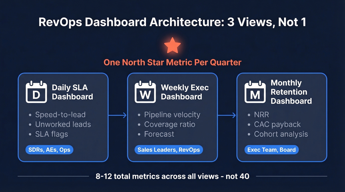
- Weekly exec dashboard - pipeline velocity, coverage ratio, forecast
- Monthly retention dashboard - NRR, churn and expansion by cohort
- Daily SLA dashboard - speed-to-lead, unworked leads
One north star metric per quarter, 1-2 KPIs per funnel stage, 2-3 views split by cadence. That's it.
What a Revenue Operations Dashboard Actually Is
It's not a reporting tool. It's a decision tool. A reporting tool shows you what happened; a RevOps dashboard tells you what to do next - across marketing, sales, and customer success in a single pane.
Let's kill the "one dashboard to rule them all" myth right now. Mixing daily operator metrics with monthly board KPIs is how you end up with a 14-chart monster nobody opens. You need multiple views, each built for a specific audience and cadence. Gartner projects 75% of highest-growth companies will deploy a RevOps model by 2026, and the dashboard is where that model either works or falls apart.
The 4 KPIs That Run RevOps
After watching teams track everything and use nothing, we've landed on four metrics that actually move decisions:
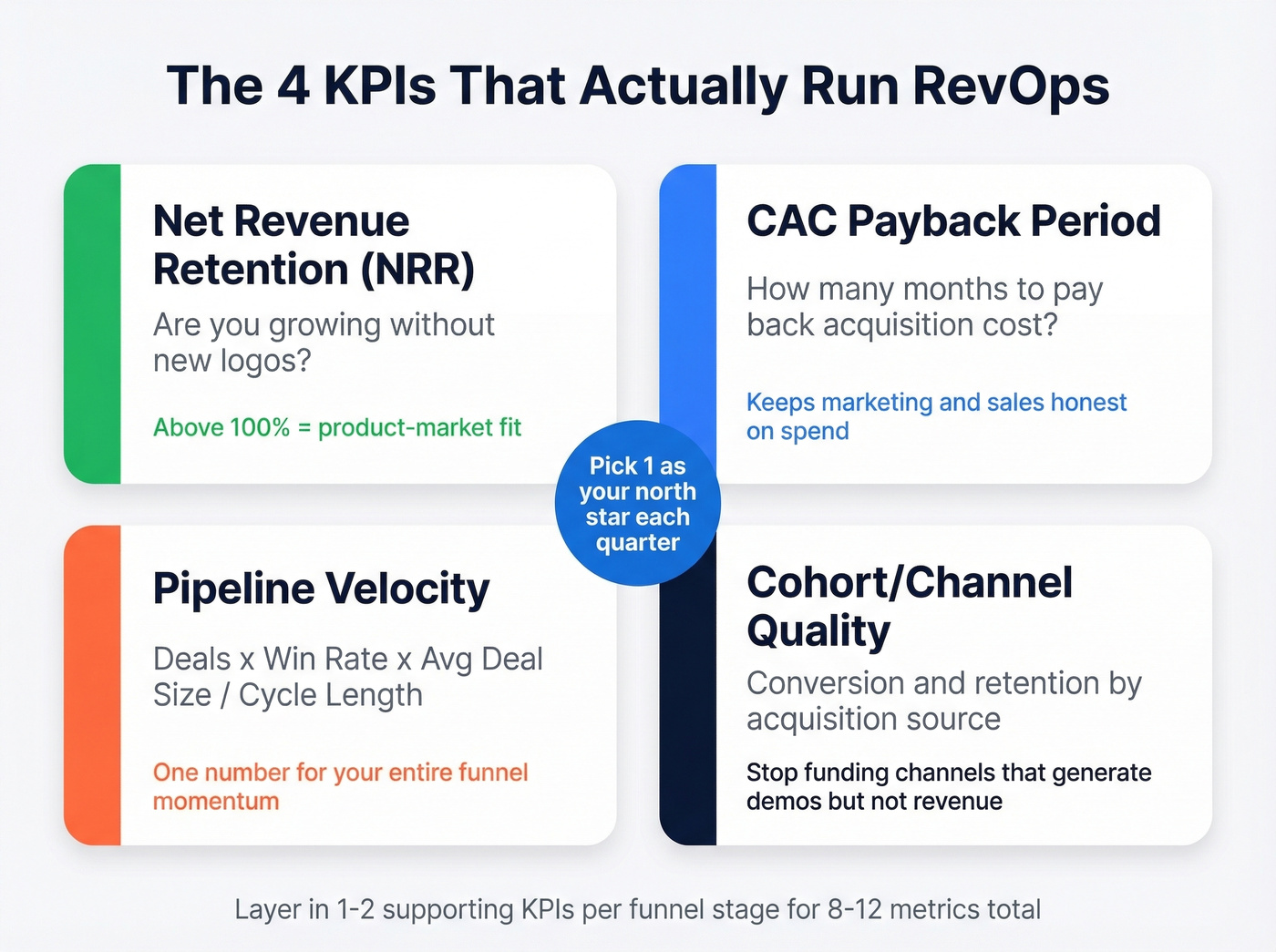
- Net Revenue Retention (NRR) - the single best indicator of product-market fit. Above 100% means you're growing even without new logos.
- CAC Payback Period - months until a customer pays back acquisition cost. Keeps marketing and sales honest about spend. (If you need a refresher on CAC math, see cost to acquire customer.)
- Pipeline Velocity - deals x win rate x average deal size / cycle length. One number for the entire funnel's momentum.
- Cohort/Channel Quality - conversion and retention by acquisition source, so you stop pouring budget into channels that generate demos but not revenue. (For a deeper breakdown of stage-by-stage measurement, use funnel metrics as a reference.)
Pick one north star per quarter. Layer in 1-2 supporting KPIs per funnel stage. That puts most teams at 8-12 metrics total - not 40.
Dashboard Views by Cadence
The biggest anti-pattern is cramming daily, weekly, and monthly metrics into one screen. Teams that split by cadence and audience cut weekly ops meeting time by 60%. In our experience, the daily SLA view is the one that actually changes behavior - reps check it because it directly affects their pipeline.
| Cadence | Audience | Core KPIs |
|---|---|---|
| Daily | SDRs, AEs, ops | Speed-to-lead, unworked leads, SLA flags |
| Weekly | Sales leaders, RevOps | Pipeline velocity, coverage ratio, forecast |
| Monthly | Exec team, board | NRR, CAC payback, cohort analysis |
Each view needs a clear owner responsible for data definitions and refresh. No owner, no dashboard. (If you're formalizing the function, this maps closely to a RevOps Manager remit.)
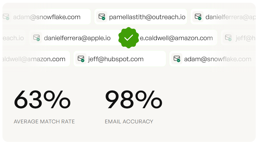
Your dashboard breaks when reps don't trust the data. Prospeo's 7-day refresh cycle and 98% email accuracy keep CRM records clean - so your pipeline velocity, coverage ratios, and forecast numbers actually reflect reality. 83% enrichment match rate across 50+ data points per contact.
Stop building dashboards on top of stale data.
RevOps Dashboard Benchmarks
Numbers without context are useless. Pin these B2B SaaS benchmarks next to your actuals so your team knows what "good" looks like:
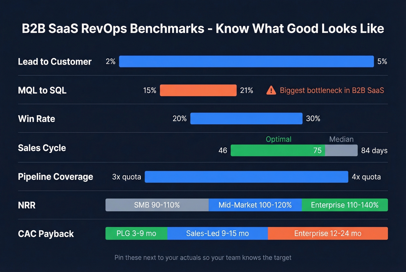
| Metric | Benchmark Range |
|---|---|
| Lead to Customer | 2-5% |
| MQL to SQL | 15-21% |
| Win Rate | 20-30% |
| Median Sales Cycle | 84 days (optimal: 46-75) |
| Pipeline Coverage | 3-4x quota |
| NRR (SMB / Mid / Enterprise) | 90-110% / 100-120% / 110-140% |
| CAC Payback (PLG / Sales-Led / Enterprise) | 3-9 mo / 9-15 mo / 12-24 mo |
MQL to SQL is the biggest bottleneck across B2B SaaS. If yours is below 15%, the problem is usually lead quality or handoff timing - not rep effort. (To diagnose where the leak is, use a simple lead generation workflow view.)
What to Track by Stage
Not every company needs a 12-metric dashboard. Early-stage teams run on "vibes," as Alex Miller (Director of RevOps at Medallion) puts it. That's fine - just make sure the vibes are tracked somewhere.
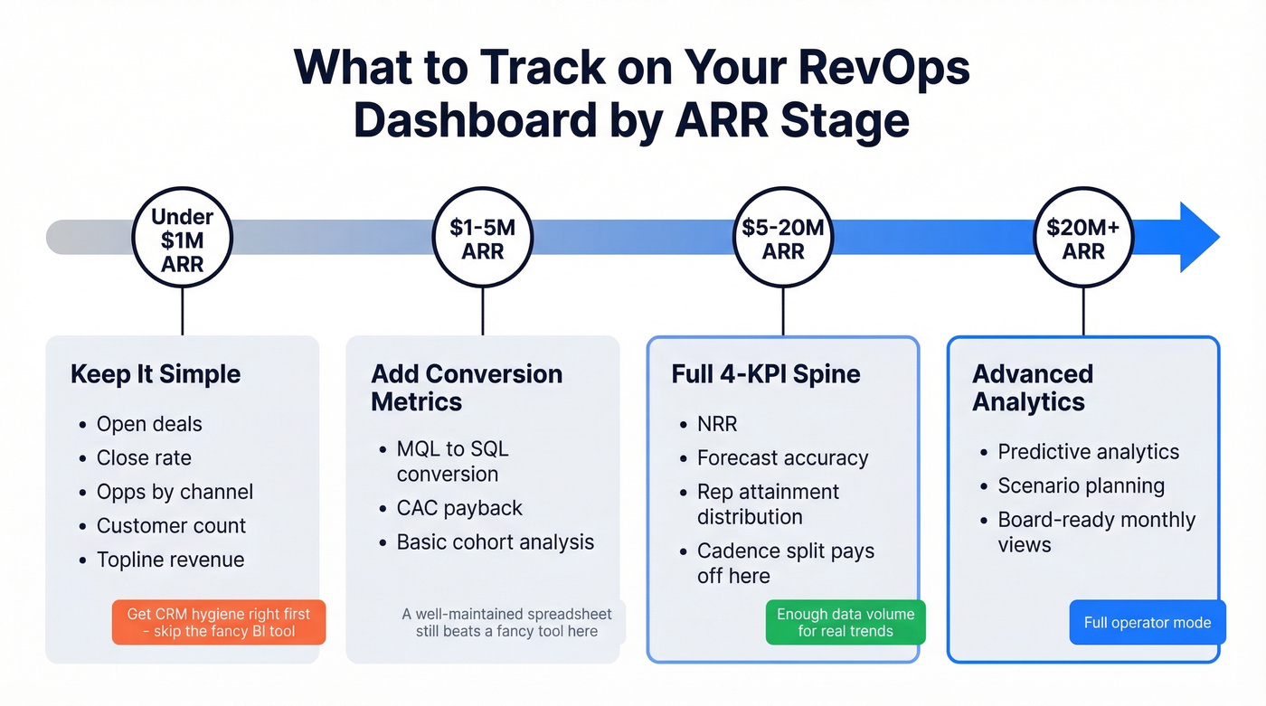
Under $1M ARR - Open deals, close rate, opps by channel, customer count, topline revenue. Don't build a pipeline velocity dashboard yet. Get your CRM hygiene right first. (If you're standardizing fields and definitions, start with lead status.)
$1-5M ARR - Add MQL to SQL conversion, CAC payback, and basic cohort analysis.
$5-20M ARR - Full 4-KPI spine. Add NRR, forecast accuracy, and rep attainment distribution. This is where the cadence split starts paying for itself because you've got enough data volume to spot real trends versus noise. (For a pipeline-first view of what predicts revenue, see pipeline health.)
$20M+ ARR - Layer in predictive analytics, scenario planning, and board-ready monthly views. (If you're going this route, B2B predictive analytics is a good starting point.)
Here's the thing: if you're under $5M ARR, a well-maintained spreadsheet with five metrics beats a fancy BI tool with thirty. The dashboard isn't the bottleneck - the data model is.
Why RevOps Dashboards Break
Most dashboards die from four failure modes. We've seen all of them, sometimes in the same quarter.
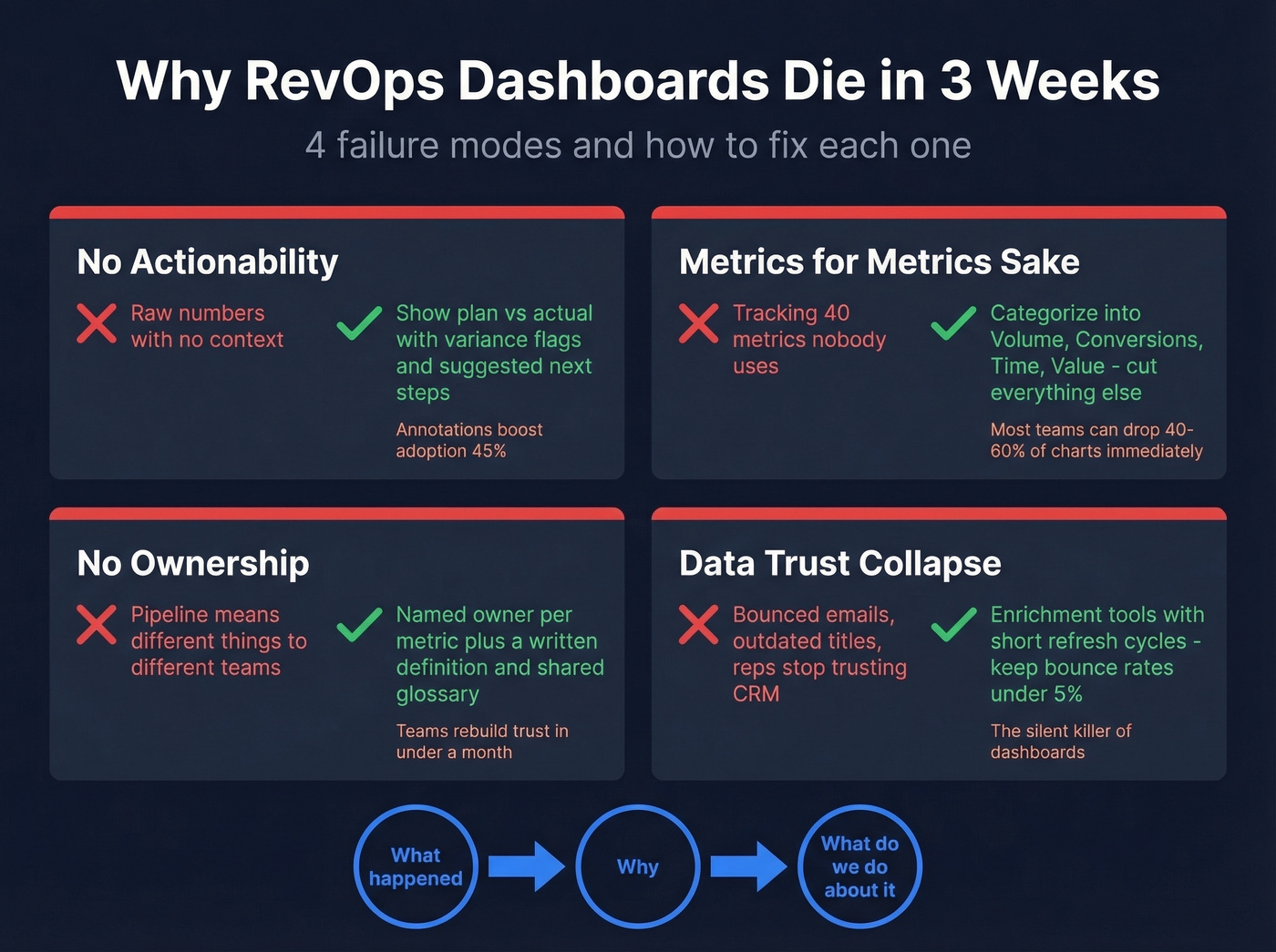
No actionability. Show plan vs actual with variance flags, not just raw numbers. If a metric is red, the dashboard should suggest a next step. Teams that added annotations to charts saw adoption increase 45%.
Metrics for metrics' sake. Categorize everything into Volume, Conversions, Time, and Value. If a metric doesn't fit one of those buckets, cut it. Shift from lagging indicators to leading ones - you want to see the problem before the quarter ends, not after.
No ownership. Every metric needs a named owner and a written definition. "Pipeline" means different things to marketing and sales. Define it once, in writing, and publish a shared glossary. We've seen teams rebuild dashboard trust in under a month just by doing this.
Data trust collapse. This is the silent killer. When CRM contacts have bounced emails and outdated titles, reps stop trusting the data - then they stop trusting the dashboard. If bounce rates exceed 5%, no visualization layer will save you. Tools like Prospeo that refresh records on a 7-day cycle at 98% email accuracy help keep the upstream data clean so your reporting doesn't drift into fiction. (If you're troubleshooting deliverability and list quality, start with email bounce rate.)
Every chart should answer three questions: what happened, why, and what do we do about it. That signal-to-insight-to-action loop is what separates a dashboard that lives from one that dies.
Templates and Tools
You don't need to build from scratch. HubSpot is a common starting point for revenue operations dashboards, and Operations Hub Professional ($800/month) adds more advanced automation and ops workflows.
For Salesforce teams, common dashboard modules include pipeline creation, win-loss analysis, and opportunity history. Plenty of teams still export or sync Salesforce data into Google Sheets for faster iteration - skip this if you've got more than 50 reps, but for smaller orgs it works surprisingly well. (If you're evaluating CRM options and patterns, see examples of a CRM.)
The Tableau RevOps Accelerator ships with exec views for at-risk ARR, churn propensity, NPS tiers, and renewal patterns. It requires specific data attributes like ARR, churn date, NPS, utilization %, and attrition risk - which doubles as a useful checklist for what your data model needs before you start building anything.
On the BI layer, Looker, Power BI, and Sigma all work. The tool matters less than the data model underneath it. Weflow's cheat sheet organizes 30 reports across five dimensions - use it as a menu, not a mandate.
The article above nails it: bounce rates above 5% kill dashboard trust. Prospeo's 5-step verification and proprietary email infrastructure keep bounce rates under 2% for 15,000+ companies. At $0.01 per email, cleaning your data costs less than one bad forecast call.
Give your RevOps dashboard a data layer it deserves.
FAQ
How many KPIs should a RevOps dashboard have?
Aim for one north star per quarter plus 1-2 supporting KPIs per funnel stage - that's 8-12 total metrics across 2-3 cadence-based views. More than that and the 30%-to-9% adoption cliff kicks in. Cut anything that doesn't trigger a clear next action.
What tools do most RevOps teams use?
CRM-native dashboards in HubSpot or Salesforce handle 80% of needs. Add a BI layer like Tableau, Looker, or Power BI for custom views. Clari (~$75/user/mo) and Gong ($100-150/user/mo) add forecasting depth but are overkill under 20 reps.
How do you keep dashboard data accurate?
Define every metric in writing, assign an owner, and set refresh cadences. For CRM contact data specifically, use an enrichment tool with a short refresh cycle - stale records are the upstream rot that makes dashboards unreliable within weeks. Bounce rates above 5% are a red flag that your data layer needs attention before your visualization layer.
What's the fastest way to fix a broken RevOps dashboard?
Start by cutting metrics that haven't driven a decision in 30 days - most teams can drop 40-60% of their charts immediately. Then assign a named owner to every surviving metric with a written definition. Finally, audit your CRM data quality. If contacts are bouncing or titles are outdated, fix the data first and the dashboard second.