10 Sales Report Examples With Actual Numbers (Not Just Descriptions)
It's Friday at 4 PM. Your VP pings you on Slack: "Can you pull together a pipeline summary before the board call Monday." You open a blank spreadsheet, stare at it, and realize you have no idea what a pipeline summary actually looks like with real numbers in the cells. Every template you find describes what a pipeline report is. None of them show you a filled-in version you can actually copy.
We built these 10 sales report examples with filled-in data, working formulas, and benchmarks so you know whether your numbers are healthy or hemorrhaging. Copy the structure, swap in your data, and send it.
Which Reports Does Your Team Actually Need?
Most teams need four or five reports. Everything else is situational.
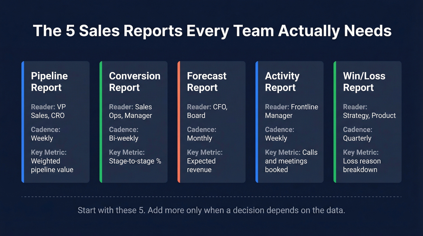
| Report Type | Who Reads It | Cadence | Key Metric |
|---|---|---|---|
| Pipeline | VP Sales, CRO | Weekly | Weighted pipeline value |
| Conversion | Sales Ops, Manager | Bi-weekly | Stage-to-stage % |
| Forecast | CFO, Board | Monthly | Expected revenue |
| Activity | Frontline Manager | Weekly | Calls/meetings booked |
| Win/Loss | Strategy, Product | Quarterly | Loss reason breakdown |
If you're running fewer than five reports, you're probably missing something. Running fifteen? Half of them are going unread. Start with these five, add the rest only when someone has a decision that depends on the data.
One thing every report has in common: they're only as useful as the contact and deal data feeding them. Stale emails, wrong titles, and ghost contacts quietly corrupt every number on this list - especially if you’re not doing regular data enrichment.
10 Filled-In Reports With Numbers
1. Pipeline Report
The pipeline report is the single most-read document in most sales orgs. It answers one question: how much potential revenue is in play right now?
| Company | Contact | Stage | Value | Probability |
|---|---|---|---|---|
| Acme Corp | Sarah Chen, VP Ops | Proposal | $85,000 | 60% |
| Bolt Logistics | James Park, CTO | Discovery | $42,000 | 20% |
| Crest Health | Maria Lopez, CFO | Negotiation | $120,000 | 75% |
| DataBridge | Tom Reeves, Dir IT | Qualified | $65,000 | 30% |
| Envoy SaaS | Priya Nair, CEO | Verbal Close | $95,000 | 90% |
Weighted pipeline value = Σ(deal value x stage probability). For this table: ($51K + $8.4K + $90K + $19.5K + $85.5K) = $254,400.
That weighted number is what your VP actually cares about - not the raw total. Best visualized as a funnel chart showing stage-to-stage value compression. If you're in a bid-driven industry like construction, government, or agencies, swap "Stage" for bid status and track active bids, bid volume by period, and awarded contracts separately. Same structure, different labels. If you want benchmarks to sanity-check the totals, use sales pipeline benchmarks.
2. Conversion Report
Conversion rate per stage tells you where deals stall. The formula is straightforward:
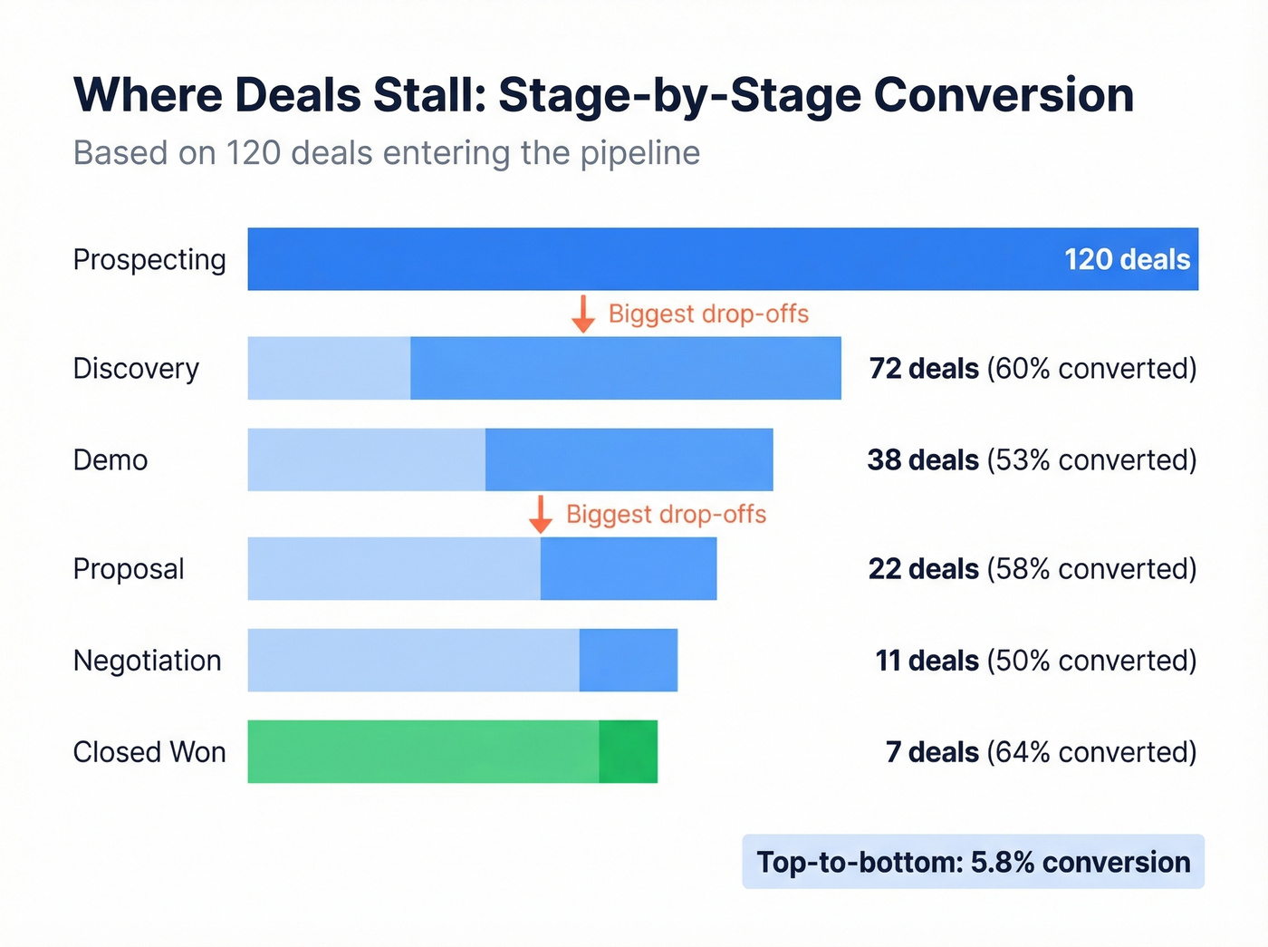
Conversion rate = (deals moved to next stage / deals in current stage) x 100
Here's a worked example tracking conversion across a full pipeline:
| Stage | Deals In | Moved Forward | Conversion |
|---|---|---|---|
| Prospecting | 120 | 72 | 60% |
| Discovery | 72 | 38 | 53% |
| Demo | 38 | 22 | 58% |
| Proposal | 22 | 11 | 50% |
| Negotiation | 11 | 7 | 64% |
| Closed Won | 7 | - | - |
Top-to-bottom conversion here is ~5.8% (7 / 120). For B2B SaaS, healthy opportunity-to-close conversion runs 20-30%, though it varies heavily by deal size and segment.
Track this by stage, not just top-to-bottom. A 53% conversion from discovery to demo but 50% from proposal to negotiation tells you pricing or competitive positioning is the bottleneck - not lead quality. Use a horizontal bar chart to make the drop-off points obvious at a glance. For deeper benchmarks and fixes, see sales conversion rate.
3. Sales Forecast Report
Forecasting is where pipeline data meets probability. The core formula from Salesflare's template:
Expected revenue = probability of closing x potential revenue
| Deal | Value | Probability | Expected Revenue |
|---|---|---|---|
| Acme Corp | $85,000 | 60% | $51,000 |
| Bolt Logistics | $42,000 | 20% | $8,400 |
| Crest Health | $120,000 | 75% | $90,000 |
| DataBridge | $65,000 | 30% | $19,500 |
| Envoy SaaS | $95,000 | 90% | $85,500 |
| Total | $407,000 | - | $254,400 |
The uncomfortable benchmark: 84% of sales reps missed quota last year, and 67% don't think they'll meet it this year either. Most forecasts didn't predict it. If your forecast consistently overshoots actuals by more than 15%, your stage probabilities are inflated - go back and recalibrate them against the last two quarters of real close rates. If you’re evaluating tooling, compare sales forecasting tools or dedicated sales forecasting solutions.
4. Weekly Activity Report
Your VP doesn't read the whole thing. We've seen this pattern play out dozens of times - they scan three things:
- Pipeline coverage ratio - is there 3x pipeline against the quarter's target?
- Forecast vs. actual - are we tracking to the number we committed?
- Top 3 deals at risk - what might slip, and what's the plan?
Everything else - calls made, emails sent, meetings booked - is supporting context. It matters for coaching, not for the Monday leadership sync. Sales professionals spend only a third of their time actively selling. If your activity report shows 200 calls but zero pipeline movement, the problem isn't effort. It's targeting. If you need ideas for what to track, use these sales activities examples.
5. Monthly Performance Scorecard
This is the scoreboard. Quota attainment by rep, revenue vs. target, and deal velocity measured as average days from opportunity creation to close.
| Rep | Quota | Closed | Attainment | Avg Deal Velocity |
|---|---|---|---|---|
| Sarah C. | $150K | $172K | 115% | 34 days |
| James P. | $150K | $98K | 65% | 52 days |
| Maria L. | $150K | $141K | 94% | 28 days |
With 84% of reps missing quota industry-wide, context matters. A rep at 94% attainment isn't underperforming - they're above the median. Use benchmarks to keep the conversation honest, and visualize attainment as a simple bar chart with a target line overlay. If you’re building a broader KPI set, pull from sales operations metrics.
6. Sales Call Report
Skip this if your team is fully inside sales. This report is for field teams tracking visit volume and outcomes. Reps average 15-25 visits per week, with high performers hitting 100. But volume alone is vanity.
A rep doing 40 visits a week with a 2% conversion rate is less productive than one doing 18 visits at 12%. Gong's research found that successful cold calls are nearly twice as long as unsuccessful ones - quality conversations beat speed-dialing every time. Track visit-to-opportunity conversion, not just visits. If your team needs a tighter system, build a cold calling system.
7. Win/Loss Analysis Report
Run this quarterly. The goal isn't to celebrate wins - it's to pattern-match losses.
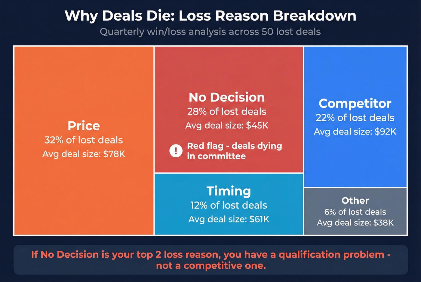
| Loss Reason | % of Lost Deals | Avg Deal Size |
|---|---|---|
| Price | 32% | $78K |
| No Decision | 28% | $45K |
| Competitor | 22% | $92K |
| Timing | 12% | $61K |
| Other | 6% | $38K |
"No Decision" at 28% is a red flag. It means deals are dying in committee, not losing to competitors. That's a qualification problem, not a competitive one. Smartsheet offers a free deal loss reasons template that charts losses by both value and count if you want a ready-made version. Visualize this as a stacked bar or treemap to make the proportions hit harder in a QBR. If you want a better QBR structure, use these QBR questions to ask.
8. Sales Cycle Length Report
How long does it take to close a deal? Enterprise deals run 6-18 months; SME deals run 1-6 months. And 28% of sales leaders say the process takes too long.
Here's the thing: if your SMB product is showing 14-month average cycles, your pipeline is clogged with dead deals that reps won't let go of. Clean the pipe, and your cycle length drops overnight. Use a scatter plot with deal size on the Y-axis and days-to-close on the X-axis - outliers become immediately obvious. If you’re diagnosing why deals stall, start with sales pipeline challenges.
9. MRR / Recurring Revenue Report
SaaS-specific, but critical if you run a subscription business. Track four numbers monthly and visualize the movement as a waterfall chart.
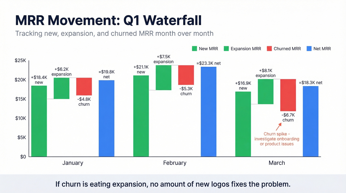
| Month | New MRR | Expansion MRR | Churned MRR | Net MRR |
|---|---|---|---|---|
| January | $18,400 | $6,200 | -$4,800 | $19,800 |
| February | $21,100 | $7,500 | -$5,300 | $23,300 |
| March | $16,900 | $8,100 | -$6,700 | $18,300 |
Net MRR = new + expansion - churned. Average customer retention runs 75%, ranging from 55-84% depending on industry. March's dip here is worth investigating - churn spiked while new MRR dropped, which often signals a product or onboarding issue rather than a sales one. If your churn is eating expansion, no amount of new logo acquisition fixes the problem. For a deeper breakdown, see churn analysis.
10. Sales-Marketing Alignment Report
This report bridges the handoff gap. Track MQL-to-SQL conversion rate, lead source attribution, and marketing-sourced pipeline as a percentage of total. When marketing generates 60% of MQLs but only 15% of closed revenue, there's a quality mismatch worth investigating.
One stat worth pinning to the wall: a first follow-up email boosts reply rates by 49%. If your SDRs aren't following up on marketing-sourced leads within 24 hours, you're leaving half the value on the table. As one marketing ops lead put it on r/sales, the handoff between marketing and sales is where leads go to die if nobody owns the SLA. If you need copy you can plug into sequences, use these sales follow-up templates.
How to Pick the Right Cadence
Weekly reporting for the sake of it is performative waste. If your enterprise pipeline moves in monthly cycles, a weekly pipeline review just generates noise and busywork. Match cadence to decision speed, not calendar habit.
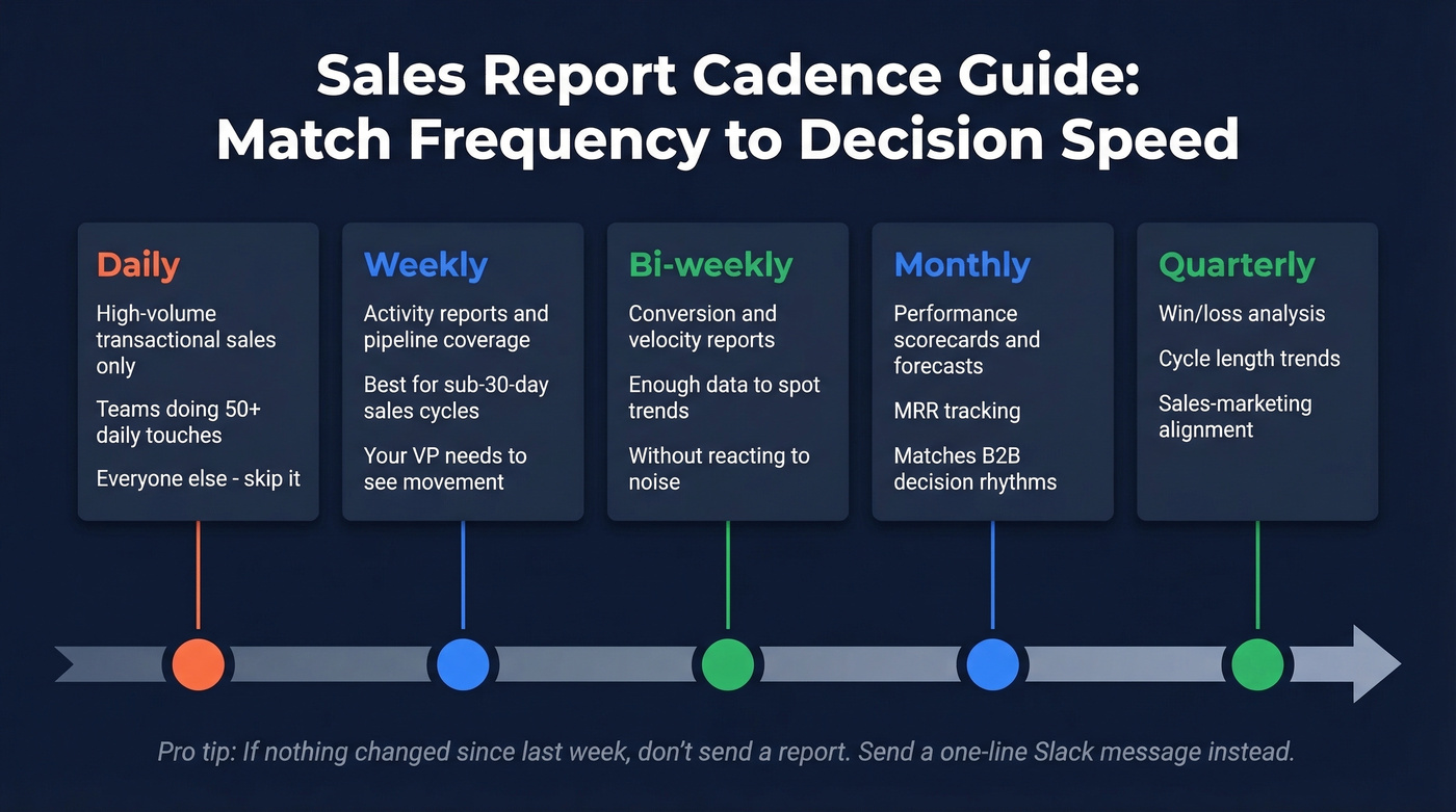
- Daily - only for high-volume transactional sales like retail and inside sales teams doing 50+ daily touches. Everyone else, skip it.
- Weekly - activity reports and pipeline coverage for teams with sub-30-day sales cycles. The VP needs to see movement, not stasis.
- Bi-weekly - conversion and velocity reports. Two weeks gives you enough data points to spot trends without reacting to noise.
- Monthly - performance scorecards, forecasts, MRR. This cadence matches most B2B decision rhythms.
- Quarterly - win/loss analysis, cycle length trends, sales-marketing alignment. These need enough volume to be statistically meaningful.
If nothing changed since last week's report, don't send one. Send a one-line Slack message: "No material changes - next update Friday." Your leadership will respect the honesty more than a recycled deck.
Every pipeline report on this page depends on one thing: accurate contact data in the right fields. Stale emails and wrong titles silently inflate your weighted pipeline and wreck your forecast. Prospeo refreshes 300M+ profiles every 7 days with 98% email accuracy - so the numbers in your reports actually mean something.
Stop forecasting on bad data. Start with contacts you can trust.
5 Mistakes That Corrupt Your Data
Inconsistent Naming Conventions
"T-shirt" vs. "TShirt" vs. "Tee Shirt" in your product field creates three separate line items in every report. Use master lists and dropdown menus in your CRM - never free-text fields for anything that gets aggregated. This sounds trivial until you realize your "top product" report is splitting revenue across six misspellings of the same SKU.
Stale Contacts Inflating Pipeline
Your pipeline says 200 opportunities worth $4.2M. But if 25% of those contacts have changed jobs, have invalid emails, or left the company entirely, your forecast is inflated by roughly $1M. That's not a rounding error - it's a board-level misrepresentation.
In our experience, the number-one cause of forecast misses isn't bad methodology - it's bad data. Run your pipeline through an enrichment tool quarterly at minimum. Prospeo, for instance, refreshes contact data every 7 days and verifies emails at 98% accuracy across 143M+ verified records, which means you're catching job changes and email bounces weeks before they show up as failed sequences.
Too Many Metrics, No "So What?"
A 40-slide deck with 85 metrics isn't a report - it's a data dump. Every metric needs a "so what?" attached. "Conversion rate dropped from 28% to 19%" is data. "Conversion rate dropped 9 points because we lost 3 enterprise deals to a new competitor in EMEA - here's the plan" is a report.
Spreadsheet Dependency
Over 70% of small businesses rely on outdated methods like spreadsheets or notebooks to track sales. Spreadsheets aren't inherently bad - but they break the moment two people edit simultaneously, someone deletes a formula, or you need to pull data across 12 monthly tabs. If you've outgrown a single-sheet tracker, it's time to move to a CRM with native reporting. If you’re evaluating options, start with these examples of a CRM.
Ignoring Data Quality Entirely
This one is the silent killer. You can have the best report structure in the world, and it won't matter if 30% of your contact records are outdated. With 81% of sales teams now using AI in their processes, your reporting stack should include at least some automation - even if it's just auto-populating a KPI dashboard from your CRM. But automation on top of dirty data just scales the problem faster.
How to Present Reports to Leadership
Executives don't want data. They want decisions.
The framework that works: setting, conflict, resolution. Setting: "We're at 78% of Q3 target with 6 weeks remaining." Conflict: "Pipeline coverage is 2.1x, below our 3x threshold, driven by a 40% drop in enterprise MQLs since August." Resolution: "We're shifting two SDRs to outbound enterprise targeting and accelerating three mid-stage deals with executive sponsorship."
Apply the "so what?" test to every slide. If you can't articulate why a metric matters to the business outcome your CFO cares about, cut it. A five-slide deck that drives a decision beats a thirty-slide deck that generates questions.
Let's be honest - most QBR decks are too long. Benchmark against peers whenever possible. "Our win rate is 24%" means nothing in isolation. "Our win rate is 24% vs. a 20-30% B2B SaaS benchmark - we're mid-pack and here's how we move to top quartile" gives leadership something to act on. Use data visualization intentionally: funnel charts for pipeline, waterfall charts for MRR changes, scatter plots for deal size vs. cycle length. The right chart type eliminates the need for half your commentary.
Tools for Building Reports
The right tool depends on team size and budget, not feature lists.
| Tool | Best For | Starting Price |
|---|---|---|
| Google Sheets | Solo / early-stage | Free |
| Excel | Small teams, offline | ~$7-22/user/mo |
| HubSpot | SMB with CRM | Free CRM; Sales Hub from ~$20/user/mo |
| Salesforce | Mid-market+ | From ~$25/user/mo |
| Power BI | Data-heavy orgs | Free desktop; Pro $10/user/mo |
| Tableau | Enterprise analytics | ~$15-75/user/mo |
| Geckoboard | Live dashboards | ~$39/mo+ |
| Smartsheet | Template-driven teams | Free templates; from ~$9/user/mo |
Smartsheet offers 15 free downloadable templates across Word, Excel, PowerPoint, PDF, and Google Sheets if you want a head start rather than building from scratch. Each template includes pre-built formulas and formatting you can adapt to your own metrics.
Small teams (under 10 reps): Google Sheets or HubSpot's free CRM. Don't overcomplicate it. A well-structured spreadsheet beats a poorly configured Salesforce instance every time.
Mid-market (10-50 reps): CRM-native reporting in HubSpot or Salesforce, paired with a data enrichment tool to keep pipeline contacts fresh. A CRM report is only as reliable as the records behind it. If you’re comparing vendors, start with data enrichment services.
Enterprise (50+ reps): Layer Power BI or Tableau on top of your CRM for cross-functional reporting. At this scale, you need a BI tool that can blend sales data with marketing, finance, and product usage data into a single analytics layer.
Hot take: Most teams with deals under $15K don't need Salesforce-level reporting infrastructure. A Google Sheet with five well-built tabs and clean data will outperform a $50K/year BI stack fed by a CRM nobody updates. Invest in data quality first, tooling second.
That 53% discovery-to-demo conversion rate? It drops fast when reps waste calls on outdated contacts. Prospeo gives your team 125M+ verified mobiles with a 30% pickup rate and direct dials to real decision-makers - so your activity reports show pipeline movement, not just dial volume.
Turn your activity reports from vanity metrics into closed revenue.
FAQ
What should a basic sales report include?
Every report needs five elements: weighted pipeline value, stage-by-stage conversion rate, revenue vs. target, activity metrics (calls, meetings, emails), and a forecast for the current period. These five give leadership enough context to make decisions without drowning in data.
How often should you send reports?
Match cadence to your sales cycle length. Weekly for transactional teams with sub-30-day cycles, monthly for enterprise teams with 6+ month deals. Daily reporting only makes sense for high-volume retail or inside sales. If nothing changed, send a one-line Slack update instead.
What's a good pipeline conversion rate?
For B2B SaaS, healthy opportunity-to-close conversion runs 20-30%. SMB deals tend to convert at the higher end, enterprise at the lower end. Stage-to-stage rates vary more - early stages often hit 40-60%, while proposal-to-close typically drops to 15-25%.
How do you fix inaccurate reports?
Start with data quality. Standardize CRM entries using dropdown fields instead of free text, enforce naming conventions, and verify your contact database quarterly. Bad data compounds fast - 25% stale contacts means your pipeline number is fiction.
What's the difference between a report and a dashboard?
Reports are point-in-time snapshots built for analysis and decision-making - they get sent, reviewed, and discussed. Dashboards are live, always-on displays for real-time monitoring. You present a report in a Monday meeting. You glance at a dashboard between calls. Most teams need both.