Email Template Analytics: Metrics That Matter and How to Fix Your Reporting
Your CMO asks why open rates dropped 12% this quarter. The real answer probably has nothing to do with your emails. Your audience mix shifted across Apple Mail Privacy Protection users, and your ESP is still showing you a number that stopped being a clean engagement signal back in late 2021. Open rate is unreliable in 2026. If it's still the headline number on your email dashboard, your analytics are lying to you.
What Template Analytics Actually Means
Email template analytics is the practice of measuring how a specific template performs across multiple sends, audiences, and time windows - then using that data to improve the template itself. It's different from campaign-level analytics, which blends template performance with subject line quality, send timing, list health, and deliverability factors all at once.
The distinction matters because most ESPs default to campaign-level reporting. You see aggregate open and click rates for a single send, but you can't isolate whether the template's layout, copy, or CTA drove the result - or whether the subject line and send time did all the heavy lifting. Template-level analysis strips away those confounding variables and asks a narrower question: does this email body actually work? That's the answer that feeds iterative design improvements, the kind that compound over quarters rather than individual campaigns.
The Short Version
Three things to get right before you build a single dashboard:
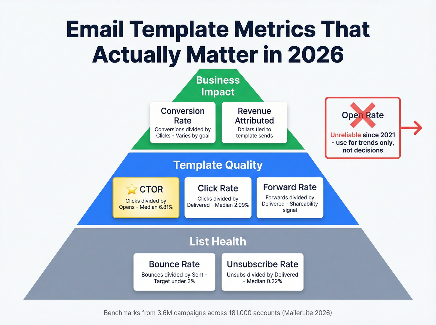
- Stop optimizing for open rate. Use click-to-open rate (CTOR) and conversion rate instead. CTOR isolates template quality from subject line and deliverability noise.
- Verify your list before analyzing anything. If 10-15% of your addresses are invalid, every downstream metric is corrupted. Run verification first. (If you need a starting point, see email ID validators.)
- Your 2026 benchmarks: 43.46% open rate, 2.09% click rate, 6.81% CTOR, 0.22% unsubscribe rate - medians from 3.6M campaigns across 181,000 accounts.
Why Open Rate Is Broken
Apple Mail Privacy Protection launched in September 2021. The mechanism is simple and devastating for tracking: Apple Mail pre-fetches email content and images in the background, firing your tracking pixel whether or not the recipient ever reads the email. Machine-generated "opens" become indistinguishable from real engagement in most ESP dashboards.
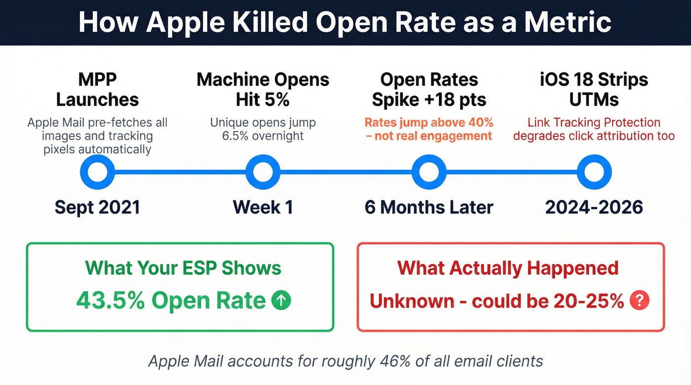
Apple Mail accounts for roughly 46% of email clients. Within the first week of MPP's launch, machine-generated opens already accounted for 5% of all opens and unique opens jumped 6.5%. Within six months, a study of 80,000+ accounts found open rates had jumped 18 points to above 40%. That's not more people reading your emails. That's Apple reading them for you.
It gets worse. iOS 18 introduced Link Tracking Protection, which strips UTM parameters from links opened in Mail and Safari. So not only are your opens fake - your click attribution is degraded too. Add AI-generated inbox previews and digest-style views, and the gap between what your ESP reports and what actually happened keeps widening. The consensus on r/emailmarketing has shifted firmly: CTOR and conversion metrics are the only reliable template signals left.
Here's the frustration in a sentence: Apple can silently fire your tracking pixel and strip your UTMs, and most ESPs still default to showing open rate as the primary metric.
Metrics That Actually Matter in 2026
CTOR is the truest measure of whether your template works. It divides unique clicks by unique opens, isolating how compelling your email body and CTA are for people who actually saw the content. A strong subject line can inflate your open rate. It can't inflate your CTOR.
Here's the thing: if your average deal size is under five figures and you're spending more than 30 minutes a week on email reporting, you're over-investing. One-page dashboard - CTOR, conversion rate, revenue attributed, bounce rate. That's it. (If you want the full breakdown, see open rate vs click rate.)
| Metric | Formula | 2026 Median | What It Tells You |
|---|---|---|---|
| CTOR | Clicks / Opens | 6.81% | Template content quality |
| Click Rate | Clicks / Delivered | 2.09% | Overall engagement |
| Conversion Rate | Conversions / Clicks | Varies by goal | Business impact |
| Bounce Rate | Bounces / Sent | < 2% target | List health |
| Unsub Rate | Unsubs / Delivered | 0.22% | Content-audience fit |
| Forward Rate | Forwards / Delivered | Varies | Shareability |
HubSpot's compilation puts the average CTOR at 5.3%, while the larger MailerLite dataset shows 6.81%. Either way, single digits is normal - don't panic if you're in that range. Open rates span 30.1% to 55.71% depending on industry, but those numbers are inflated by MPP across the board. Use them for trend analysis only.
Every metric in this article becomes meaningless when your emails bounce. Bad addresses corrupt your CTOR, inflate unsubscribe rates, and make template analysis impossible. Prospeo's 5-step verification delivers 98% email accuracy - so every data point you track reflects real engagement, not list rot.
Fix your list health before you touch another dashboard.
How to Analyze Template Performance
Isolate the Template
Compare the same template across multiple sends, different audience segments, and different time periods. A single send tells you almost nothing. Aim for at least five sends before template-level patterns become reliable, and segment by device and email client - Gmail versus Outlook performance splits can be dramatic, with mobile rendering differences adding another layer of noise that you need to account for before blaming your copy.
When presenting findings to stakeholders, structure your report in three layers: reach metrics first (delivery rate, list health), then engagement (CTOR, click rate), then business impact (conversions, revenue attributed). This keeps the conversation focused on outcomes rather than vanity numbers. (If you're formalizing this, an email marketing audit framework helps.)
Read Your Click Maps
Email click maps are click-based visualizations showing where recipients clicked, using color intensity to highlight clusters. Unlike website heatmaps, email click maps don't track scroll depth or mouse movement due to static rendering constraints.
A few rules for reading them correctly. Clicks on images often reflect link placement, not attention - don't confuse the two. Always look at unique clicks versus total clicks; a single person rage-clicking a broken link will skew totals badly. Segment by device, because a CTA that's thumb-friendly on mobile might be buried on desktop. And focus on patterns across multiple sends rather than isolated data points from one campaign.
Check Rendering Before Blaming Content
You redesigned your newsletter template, CTR went down. Before you revert - did you test rendering in Gmail dark mode on Android? Your new CTA button might be invisible.
There are 300,000+ different ways a single email can render across clients and devices. Over a third of users open emails in dark mode, and 70% of emails show at least one spam-related issue that could affect inbox placement. When your analytics show a sudden performance drop, rendering is the first thing to check. Not your copy. (For the inboxing side, use an email deliverability checklist.)
A/B Testing Without Fooling Yourself
Most A/B tests in email marketing are statistically meaningless. We've seen teams declare winners on 500-person splits - that's a coin flip, not a test.
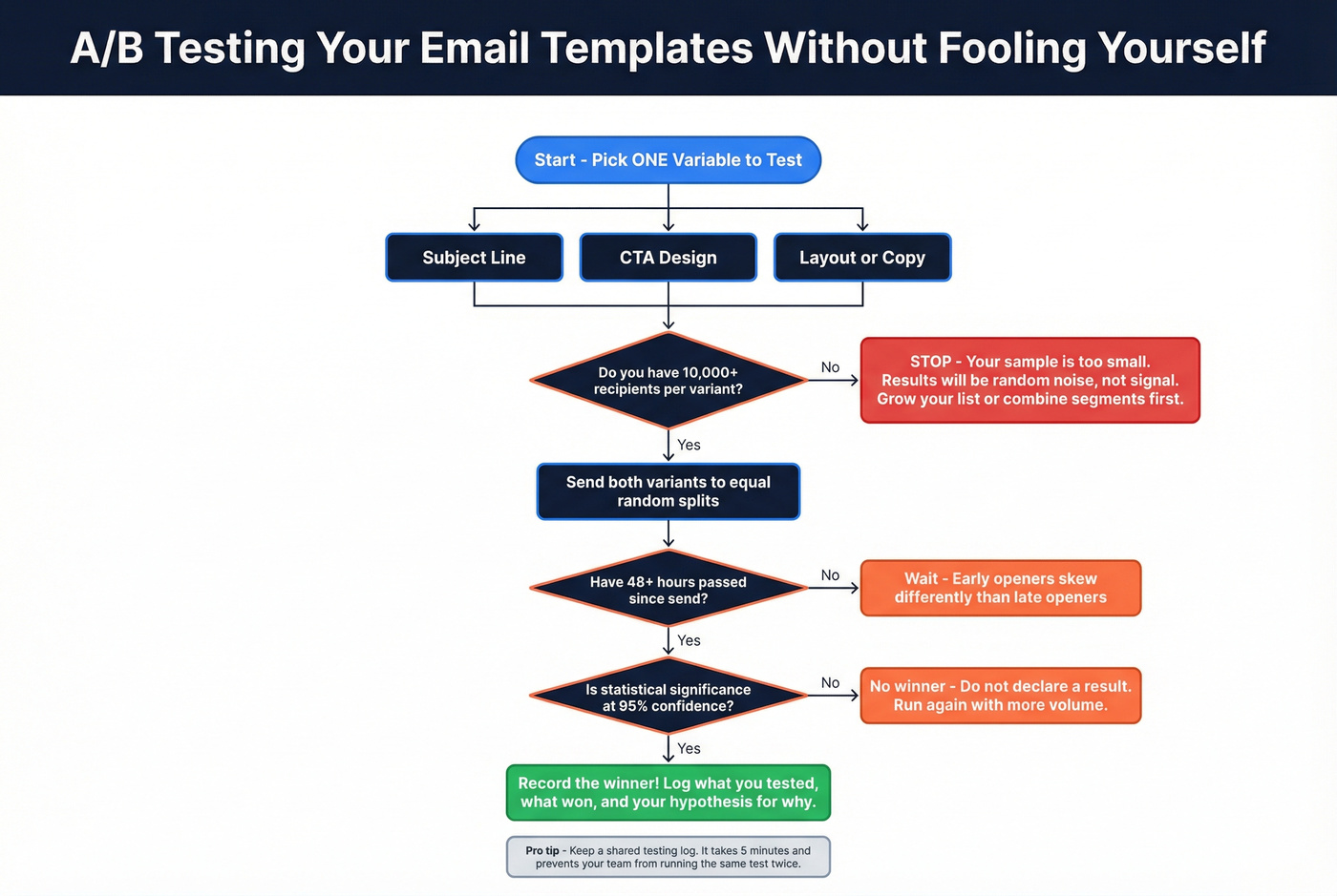
You need a minimum of 10,000 recipients per variant. Anything smaller and random noise dominates your results. Change one variable at a time: subject line OR CTA OR layout, never all three. Wait at least 48 hours before calling a winner, because early openers skew differently than late openers. And demand 95% confidence - if your ESP doesn't show statistical significance, calculate it yourself with an online calculator. (If you're picking software, compare email A/B testing tools.)
The most common A/B testing failure isn't methodology. It's that nobody records what was tested, what won, and why. Three months later, someone runs the same test again. Keep a shared log. It takes five minutes and saves weeks of redundant testing.
Clean Data: The Foundation of Accurate Analytics
Let's be honest - most email analytics guides skip the single biggest variable: data quality. If 15% of your list is invalid, every metric lies. (This is the same problem as B2B contact data decay showing up downstream as “performance issues.”)
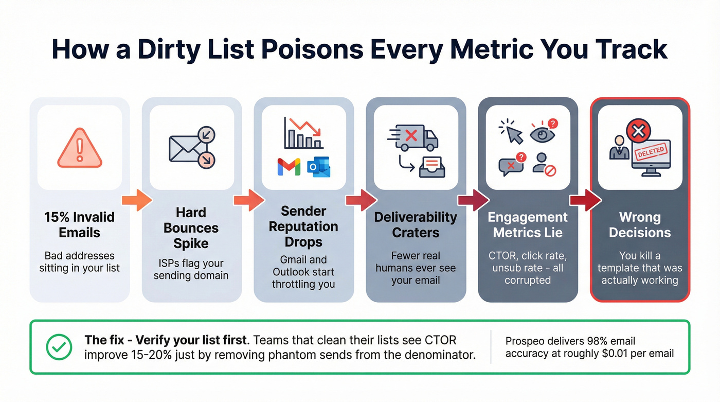
Here's the chain reaction. Invalid emails generate hard bounces. Hard bounces damage your sender reputation. Damaged reputation means ISPs throttle your deliverability. Fewer real humans see your email, which means your engagement metrics crater for reasons that have nothing to do with your template. In our experience, we've run audits where cleaning the list alone improved apparent CTOR by 15-20%, simply because the denominator was no longer polluted with phantom sends. (If you’re diagnosing the symptom, start with hard bounce.)
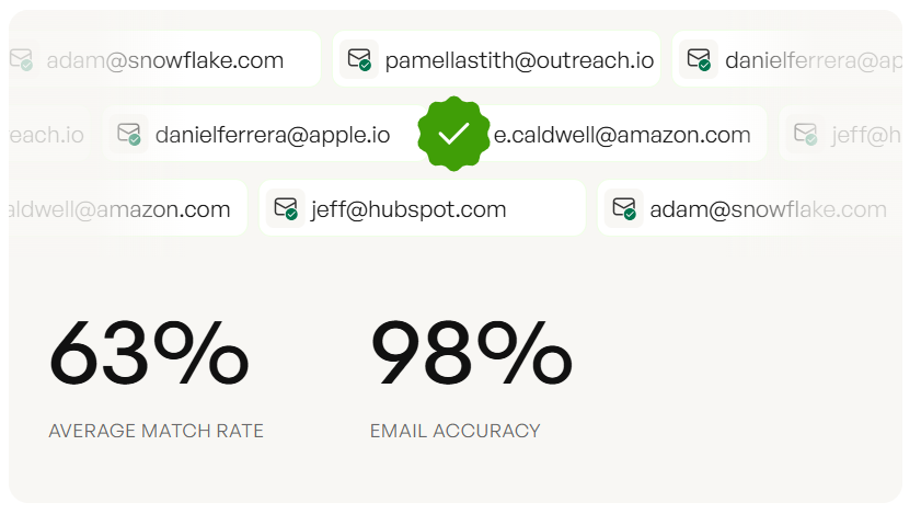
Your analytics are only as accurate as your email list. Prospeo runs every address through a 5-step verification process with catch-all domain handling, spam-trap removal, and honeypot filtering - delivering 98% email accuracy at roughly $0.01 per email. The free tier gives you 75 verifications per month to test it. (More on the mechanics: verification email.)
Best Tools for Template Analytics
| Tool | Best For | Starting Price | Free Tier |
|---|---|---|---|
| Prospeo | List verification (step zero) | ~$0.01/email | 75 emails/mo |
| MailerLite | Click maps + benchmarks | $10/mo | 500 subscribers |
| Klaviyo | E-commerce flows | $20/mo | 250 contacts |
| Mailchimp | Integrations | $13/mo | 250 contacts |
| HubSpot | Sales template tracking | $20/mo | 2,000 emails/mo |
| Litmus | QA + rendering tests | ~$79/mo | No |
| DashThis | Multi-channel dashboards | ~$49/mo | 15-day trial |
| MailerSend | Transactional analytics | $7/mo | 500 emails/mo |
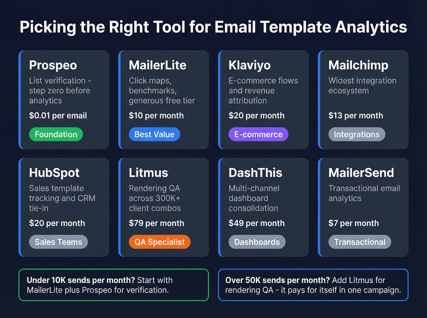
MailerLite is the best value for most teams - click maps, solid benchmarks, and a generous free tier that lets you get meaningful data before spending a dollar. We've recommended it to early-stage teams more than any other ESP on this list.
Litmus is the specialist pick if rendering QA is your bottleneck. It's pricier, but catching an invisible CTA button before you send to 50,000 people pays for itself in a single campaign. Skip this one if you're sending under 10,000 emails a month - the ROI won't be there.
For teams running multi-channel outreach, DashThis consolidates email data alongside other channels so you can compare template performance in context. MailerSend is worth a look for transactional email analytics specifically - it's the cheapest option here and punches above its weight on delivery reporting.
You're isolating template performance across sends, segmenting by device, reading click maps - all smart moves. But if a third of your contacts have stale data, your benchmarks are fiction. Prospeo refreshes 300M+ profiles every 7 days, not every 6 weeks like most providers.
Clean data in, clean analytics out - starting at $0.01 per email.
FAQ
What's a good click-to-open rate in 2026?
Median CTOR across industries is 6.81%, based on 3.6M campaigns. Anything above 8% is strong. Below 4%, start by testing your CTA placement and copy - those two variables move CTOR fastest.
Should I still track open rate?
Track it for trend analysis only, but don't optimize for it. Apple MPP inflates opens for roughly 46% of email clients. Use CTOR and conversion rate for template performance decisions instead.
How do I know if bad data is skewing my analytics?
If your bounce rate exceeds 2%, your list contains invalid addresses corrupting every downstream metric. Run verification before drawing conclusions - even auditing a sample of a few hundred addresses will tell you whether you've got a systemic problem.
How does reply rate fit into template analytics?
Reply rate is especially valuable for outbound sales sequences where the goal isn't a click but a conversation. It measures how often recipients respond to a given template, helping you distinguish templates that generate genuine interest from those that only drive passive clicks. Track reply rate alongside CTOR for a complete picture.