How to Build a Monthly Sales Report That Actually Gets Read
It's the last Friday of the month. You've got 45 minutes before the leadership meeting, and you're staring at a CRM export that looks like it was designed to confuse rather than inform. Sales reps spend roughly 2 hours per day actually selling - and over an hour on admin tasks like this. Your monthly sales report shouldn't be one of those time sinks. It should take 30 minutes to produce and 30 seconds to understand.
What You Need (Quick Version)
Your report needs exactly three things: the right KPIs for your audience, a consistent template you reuse every month, and a 200-word narrative that explains what the numbers mean. Pick 3-5 KPIs max. Use the benchmarks and filled-in example below to calibrate your own numbers. Stop rebuilding from scratch every month.
And if your CRM data is dirty - bounced emails, disconnected phones, duplicate records - fix that first. Every metric you build on bad data is fiction.
What a Monthly Sales Report Actually Is
A monthly sales report is a structured snapshot of your team's selling activity, pipeline health, and revenue outcomes over the past 30 days. It's not a weekly activity log - too granular - and it's not a quarterly business review - too strategic. It sits in the middle: detailed enough to spot problems, high-level enough that a VP can absorb it in under a minute.
Here's a distinction most teams get wrong. There's a real difference between a performance report and a cash-flow report. One Reddit user illustrated this perfectly: $10,000 in income with an estimated 40% COGS looks like $6,000 profit on a performance basis. But if you bought $10,000 in inventory that same month, the cash-flow report shows $0 profit. Both are "correct" - they just measure different things.
Declare upfront whether your report measures sales performance or cash movement. Mixing the two is how you end up with a report nobody trusts.
Essential KPIs and How to Pick Yours
Jim Collins nailed it: "If you have more than 3 priorities, you don't have any." The same applies to your sales reporting. Pick 3-5 KPIs that directly connect to the decisions your audience needs to make. Everything else is noise.
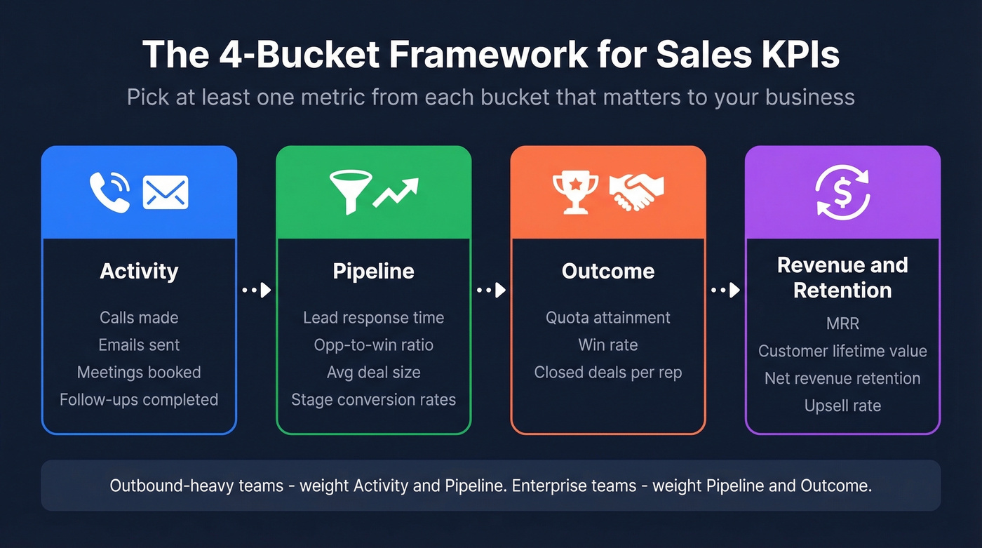
The simplest way to think about KPI selection is the 4-bucket framework. Every sales metric falls into one of four categories:
- Activity - calls made, emails sent, meetings booked, follow-ups completed
- Pipeline - lead response time, opportunity-to-win ratio, average deal size, stage conversion rates
- Outcome - quota attainment, win rate, closed deals per rep
- Revenue & Retention - MRR, customer lifetime value, net revenue retention, upsell rate
Your report should pull at least one metric from each bucket that matters to your business. An outbound-heavy team will lean into Activity and Pipeline. A team selling six-figure enterprise deals will focus on Pipeline and Outcome. Don't try to cover all four equally - weight them based on your sales motion.
KPI selection also varies by industry: a SaaS team tracks MRR and net retention, while a services firm cares more about utilization and project close rate. Pick the buckets that match your revenue model.
If you want a tighter system for choosing and interpreting metrics, lean into data-driven selling principles so your report maps to real decisions.
KPI Benchmarks
Here are the KPIs that belong in most B2B reports, with formulas and benchmark ranges so you can calibrate your own numbers:
| KPI | Formula | Benchmark |
|---|---|---|
| Win Rate | Won / Total Closed x 100% | 20-30% (avg ~21%) |
| Pipeline Coverage | Pipeline Value / Quota | 3-4x |
| Sales Cycle | Avg days, opp creation to close | 3-6 months |
| Close Rate | Won / Total Pipeline Opps | 15-25% |
| Deal Slippage | Slipped Deals / Forecasted | <20% |
| Sales Velocity | (Opps x Win Rate x Avg Deal) / Cycle | Varies |
One thing we've noticed across dozens of teams: sales cycles have lengthened by 32% since 2021, with enterprise cycles up 36%. If your numbers look worse than these benchmarks, the market shift is likely part of the story - and that context belongs in your narrative section.
If you’re pressure-testing pipeline numbers, it helps to sanity-check against sales pipeline benchmarks and a dedicated pipeline health framework.
Outbound Activity Metrics
If your team runs outbound, you need a separate activity layer. Track both volume and efficiency - a rep who makes 80 dials and books 6 meetings is outperforming one who makes 120 dials and books 4.
The metrics that matter: dials per day, conversations per day, connect rate, emails sent, meetings booked per rep, and average call duration. Don't dump all of these into the executive report. Pick the two or three that tell the story of whether your outbound engine is healthy.
To make activity metrics actionable, align them to concrete sales activities examples and modern sales prospecting techniques.
Tailor the Report to Your Audience
The biggest mistake in sales reporting isn't picking the wrong KPIs - it's sending the same report to everyone. A rep needs to see their own numbers against target. A VP needs trends across regions and product lines. A board member needs three numbers and a forecast.
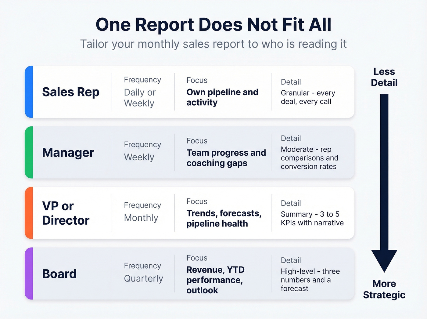
| Audience | Frequency | Focus | Detail Level |
|---|---|---|---|
| Rep | Daily/Weekly | Own pipeline, activity | Granular |
| Manager | Weekly | Team progress, coaching | Moderate |
| VP/Director | Monthly | Trends, forecasts | Summary |
| Board | Quarterly | Revenue, YTD, outlook | High-level |
For the monthly report specifically, one practitioner on r/sales described the ideal format: a rep leaderboard showing individual revenue, progress toward quarterly team targets, next-month individual targets, and an agenda for upcoming SPIFs or promotions. That's a clean 1-2 page format that works even for teams that aren't particularly high-tech.
If you’re building this into a repeatable operating rhythm, borrow structure from sales operations metrics and sales performance management.
Step 3 says clean your data before pulling a single metric. Prospeo's CRM enrichment returns 50+ data points per contact with a 92% match rate - deduplicating records, verifying emails to 98% accuracy, and filling in missing phone numbers. Stop building monthly reports on fiction.
Fix your CRM data in minutes, not hours. Reports get accurate overnight.
How to Create Your Monthly Sales Report
Six steps. The first five are mechanical - the sixth is where the real value lives.
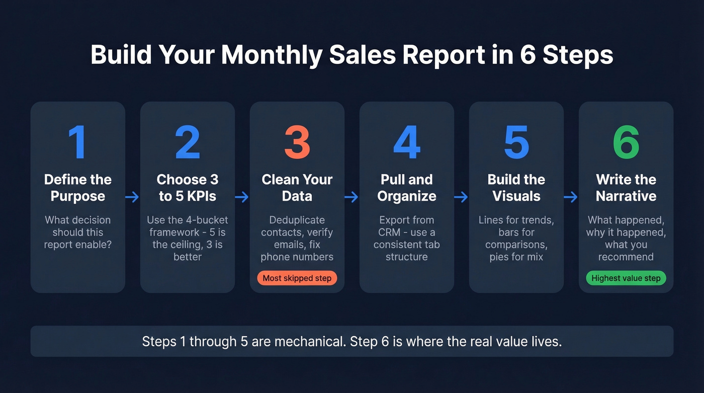
Step 1 - Define the Purpose
Before you touch a spreadsheet, answer one question: what decision should this report enable? If it's a VP reviewing regional performance, the report needs pipeline coverage by territory and quota attainment by team. If it's a sales manager running a Monday coaching session, it needs rep-level activity and conversion rates. The purpose dictates everything else.
Step 2 - Choose 3-5 KPIs
Pull from the 4-bucket framework above. Match the KPIs to your audience. Resist the urge to add "just one more metric." Five is the ceiling. Three is better.
Step 3 - Clean Your Data
This is the step everyone skips, and it's the one that corrupts every number that follows. Duplicate contacts inflate activity counts. Bounced emails make outreach volume look higher than it is. Disconnected phone numbers deflate connect rates. Run a deduplication pass and verify your contact data before you pull a single number.
We've seen teams shocked by how much stale or duplicate data sits in their CRM - which means every metric built on that foundation is fiction. If you’re seeing systematic issues, it’s usually a sign you need lead enrichment or one of the dedicated data enrichment services.
Step 4 - Pull and Organize
Export from your CRM or BI tool. Organize by the KPIs you chose in Step 2. If you're working from a template in Excel, create a consistent tab structure: summary on top, detail tabs underneath. If you're using a CRM dashboard, build a saved view you can reuse monthly.
If your CRM setup is messy, it can help to standardize around contact management software so exports and dashboards stay consistent.
Step 5 - Build the Visuals
Line graphs for trends over time. Bar charts for rep-to-rep or region-to-region comparisons. Pie charts for revenue mix by product or segment. That's the full toolkit - you don't need anything fancier. If someone has to study your chart to understand it, simplify.
Step 6 - Write the Narrative
Here's the thing: the numbers are the skeleton. The narrative is the muscle. A 200-word interpretation that explains why the numbers moved and what to do about it is the single highest-value component of your report.
Write three things: what happened, why it happened, and what you recommend. Something like this:
"Win rate dropped from 26% to 19% this month. Two enterprise deals that were forecast to close pushed to Q2 due to procurement delays, which disproportionately impacted the number. Recommendation: pipeline review for all deals with close dates in the next 45 days to pressure-test timing."
That paragraph is worth more than every chart in the report combined.
Filled-In Report Example
Downloadable templates exist, but a filled-in example you can adapt to your own numbers is more practical than a blank form. Here's a realistic report for a fictional 8-rep B2B SaaS team selling mid-market deals.
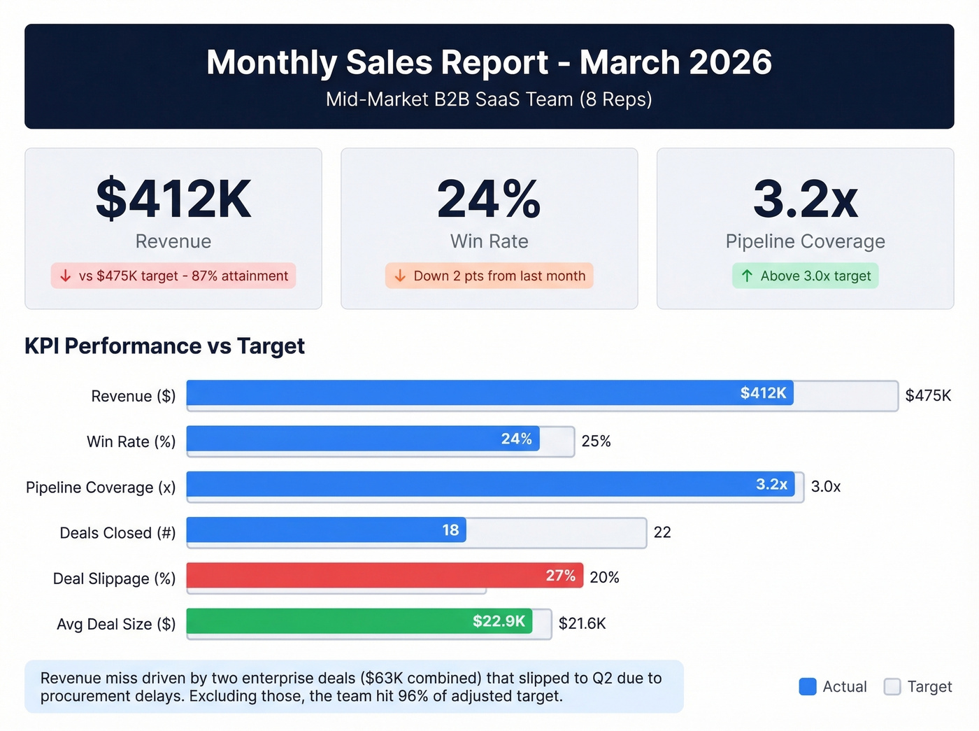
Executive Summary: March revenue came in at $412K against a $475K target (87% attainment). Pipeline coverage remains healthy at 3.2x, but deal slippage increased 15% month-over-month. Two enterprise deals worth a combined $63K pushed to Q2 due to procurement delays.
| KPI | March Actual | Target | MoM Trend |
|---|---|---|---|
| Revenue | $412K | $475K | Down 8% |
| Win Rate | 24% | 25% | Down 2pts |
| Pipeline Coverage | 3.2x | 3.0x | Up 0.3x |
| Deals Closed | 18 | 22 | Down 4 |
| Deal Slippage | 6 deals (27%) | <20% | Up 15% MoM |
| Avg Deal Size | $22.9K | $21.6K | Up 6% |
Narrative: The revenue miss is almost entirely attributable to two enterprise deals ($38K and $25K) that slipped past their original close dates. Both are in final legal review and expected to close in the first two weeks of April. Excluding those, the team hit 96% of adjusted target. Average deal size is trending up, which suggests the team is qualifying better but closing slower - consistent with the broader market trend of lengthening B2B sales cycles.
Recommended Actions:
- Conduct pipeline review for all Q2 deals over $20K to validate close dates.
- Implement a procurement-readiness checklist for enterprise deals to catch delays earlier.
- Recognize top performer (Rep 4: 118% attainment) at next team meeting.
Use this example as a starting point, then adjust the KPIs and narrative to reflect your team's sales motion and deal complexity.
Mistakes That Kill Report Credibility
Leading with vanity metrics. Nobody cares that your team sent 4,200 emails last month. They care about how many turned into pipeline. Lead with outcome and pipeline KPIs; use activity metrics as supporting context.
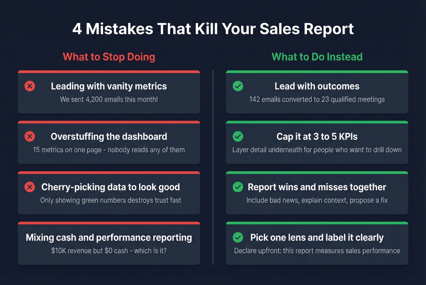
Overstuffing the dashboard. Cap it at 3-5 KPIs. If your report has 15 metrics, your audience will read zero of them. Layer detail underneath for people who want to drill down.
Cherry-picking data to look good. Report wins and misses together. A report that only shows green numbers loses credibility fast. Include the bad news, explain the context, and propose a fix.
Mixing cash and performance reporting. Pick one lens and label it clearly. A report that shows $10K in revenue but $0 in cash because of an inventory purchase isn't wrong - it's confusing without an explanation of which method you're using.
Building on dirty CRM data. Your report is only as accurate as the data feeding it. If 15% of emails bounce and phone numbers are disconnected, activity metrics are inflated and conversion rates are deflated. Tools like Prospeo verify contact data on a 7-day refresh cycle with 98% email accuracy, so the numbers in your report reflect what actually happened - not what your CRM guessed.
Tools and Templates
The right tool depends on your team size and reporting complexity. Don't overthink this.
Spreadsheets work for teams under 10 reps. Google Sheets with a clean template is honestly fine - it's free, everyone knows how to use it, and you can build a reusable structure in an afternoon. If you need a free Excel template, Microsoft's template gallery and sites like Smartsheet offer solid starting points you can customize to your KPIs. The limitation shows up when you need multi-dimensional breakdowns across channels, geographies, and product lines - that's where pivot tables start to break down. For teams already in Notion or Airtable, both support basic sales dashboards, though they lack the formula depth of a dedicated spreadsheet.
CRM dashboards make sense once you pass 10 reps. Salesforce, HubSpot, and Close all have built-in reporting that auto-updates. The data's already there - you're just choosing which views to surface.
If you’re evaluating systems, it can help to review a few examples of a CRM before you commit.
Reporting and visualization tools are for teams that need polished, board-ready output. Looker Studio connects to most data sources and produces clean dashboards for free. DashThis is purpose-built for recurring reports - set it up once and it refreshes automatically. Smartsheet works well for agencies managing multiple client reports.
| Tool | Starting Price |
|---|---|
| Google Sheets | Free |
| Excel (M365) | $6-22/user/mo |
| Looker Studio | Free |
| HubSpot CRM | Free; Sales Hub $20/user/mo |
| Salesforce | From $25/user/mo |
| Close | From $29/user/mo |
| DashThis | From $49/mo |
| Smartsheet | From $9/user/mo |
Turn Your Report Into Action
If your report doesn't change at least one behavior per month, it's wasted effort. The whole point is to surface something actionable - a coaching opportunity, a process fix, a resource reallocation.
Here's a concrete example from Unito's reporting guide: a rep discovered through monthly reporting that sending a follow-up email after every discovery call increased closed sales by 14%. That insight came from the report. It became a team-wide best practice. That's the ROI of good reporting.
In our experience, the teams that get the most from their monthly sales report spend 80% of their time on the narrative and 20% on the numbers. Stop rebuilding from scratch every month. Build one template, automate the data pull from your CRM, and invest your energy in the story the data tells. The narrative is where you earn your credibility as a sales leader. It's where you turn numbers into coaching, and coaching into revenue.
If you want to operationalize the “recommended actions” section, keep a library of sales follow-up templates so managers can turn insights into consistent execution.
Hot take: If your average deal is under $10K and your team is fewer than five reps, you probably don't need a monthly report at all. A weekly pipeline check-in and a quarterly revenue review will serve you better. Monthly reporting earns its keep when there's enough deal volume and team complexity to generate real patterns - otherwise you're just producing paperwork.
Every connect rate, every meeting-booked metric, every outbound activity number in your monthly report depends on whether your reps are reaching real people. Prospeo delivers 125M+ verified mobile numbers with a 30% pickup rate and emails refreshed every 7 days - not the 6-week-old data inflating your bounce rates.
Bad data doesn't just hurt deliverability - it corrupts every KPI in your report.
FAQ
What should a monthly sales report include?
An executive summary, 3-5 KPIs with benchmarks, trend visuals, a narrative explaining why numbers moved, and recommended next actions. Tailor depth to your audience - VPs need trend lines, reps need granular pipeline data. One to two pages is the sweet spot for leadership.
What KPIs matter most?
Win rate, pipeline coverage ratio, and quota attainment are the three most actionable for most B2B teams. The average B2B win rate sits around 21%. Add sales velocity and deal slippage if you're running complex deals with multi-month cycles.
Should I use Excel or a CRM dashboard?
Teams under 10 reps do fine with a template in Excel or Google Sheets - both are free and flexible. Past 10 reps, or when you need multi-dimensional breakdowns, a CRM dashboard saves hours of manual formatting every month.
How do I make sure my report data is accurate?
Audit your CRM contacts quarterly at minimum. Bounced emails and disconnected numbers inflate activity metrics and deflate conversion rates. A data verification tool with a short refresh cycle - Prospeo's is 7 days - keeps your contact foundation clean automatically, no manual scrubbing required.